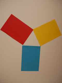
This morning we found out a few things about colour relationships, making our own colour wheel using coloured card placed on the table tops.
Here are the 3 PRIMARY colours and as we found out last week we can make all the colours of the rainbow from these colours!
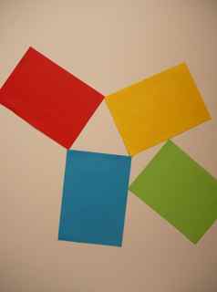
We added another colour, which was the combination of two primaries, so yellow and Blue made GREEN so we added this to our arrangement. GREEN is a SECONDARY colour.
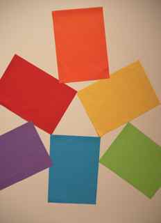
here are all the secondary colours
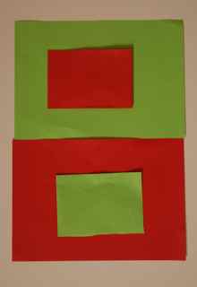
Then we explored further our wheel, identifying the COMPLEMENTARY colours.
These are colours that sit opposite each other on the colour wheel – so RED is the COMPLEMENT of GREEN (green is made by mixing blue and yellow).
YELLOW COMPLEMENTS PURPLE (made by mixing red and blue).
exploring complementary colours
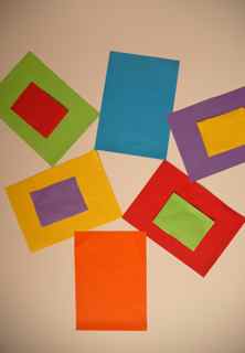
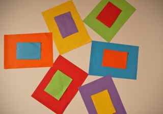
I asked the children to document all the additions to their colour wheels and to note what the effect is of placing complementary colours against each other, for example:
One child noticed that these ‘MADE A GREAT TEAM!’ What a fantastic reaction and well put!
Others noticed that the colours appeared darker or lighter depending on what was behind them. So we realised that backgrounds were important and that our perception of colour depended on what relationship it had with colours beside it etc.
I showed the children a work of art by the French artist, Henri Matisse who at the end of his life made a series of works he called ‘cut outs. here is one of his arrangements of cut out shapes, which he called THE SNAIL:
The Snail by Henri Matisse 1953
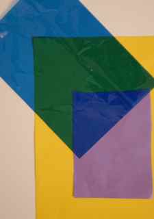
The children were encouraged to make an arrangement of their own and to document this. They worked on their tables in groups.
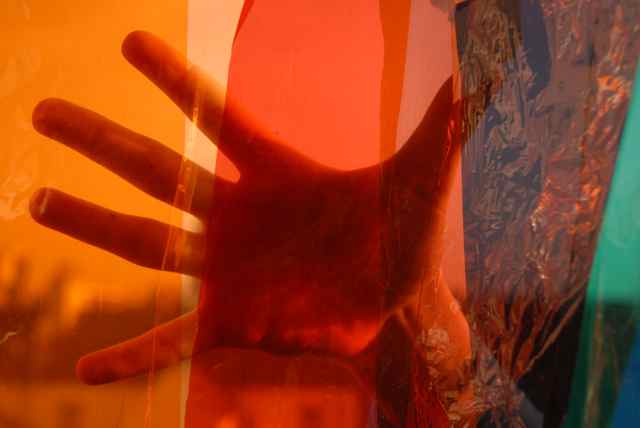
Next we explored some TRANSPARENT sheets of colour (cellophane) and the effect of it when placed on the SOLID, OPAQUE colour.
The real fun began when we started to look through the transparent sheets of cellophane and see the effects:
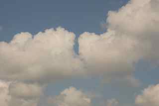
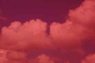
Here's a photo of clouds in the sky taken normally
here the clouds are seen through a red filter - cellophane
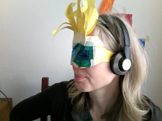
We talked about the effects of the filter and colours and a similar effect that we get when we put a pair of sunglasses on. We decided to make our own sunglasses and the creativity knew no bounds…..