The return to our project about feeling kicked off today exploring the idea of CONTROL. This came about because in the feedback on some of the activities before Christmas break, the children had said they really enjoyed the FREEDOM of painting and drawing what they wanted… with no-one telling them what to do.
I was interested in looking at this idea more closely and thought about contrasting FREEDOM with CONTROL. Such things as PAINTING BY NUMBERS and COLOURING IN activities came to mind.
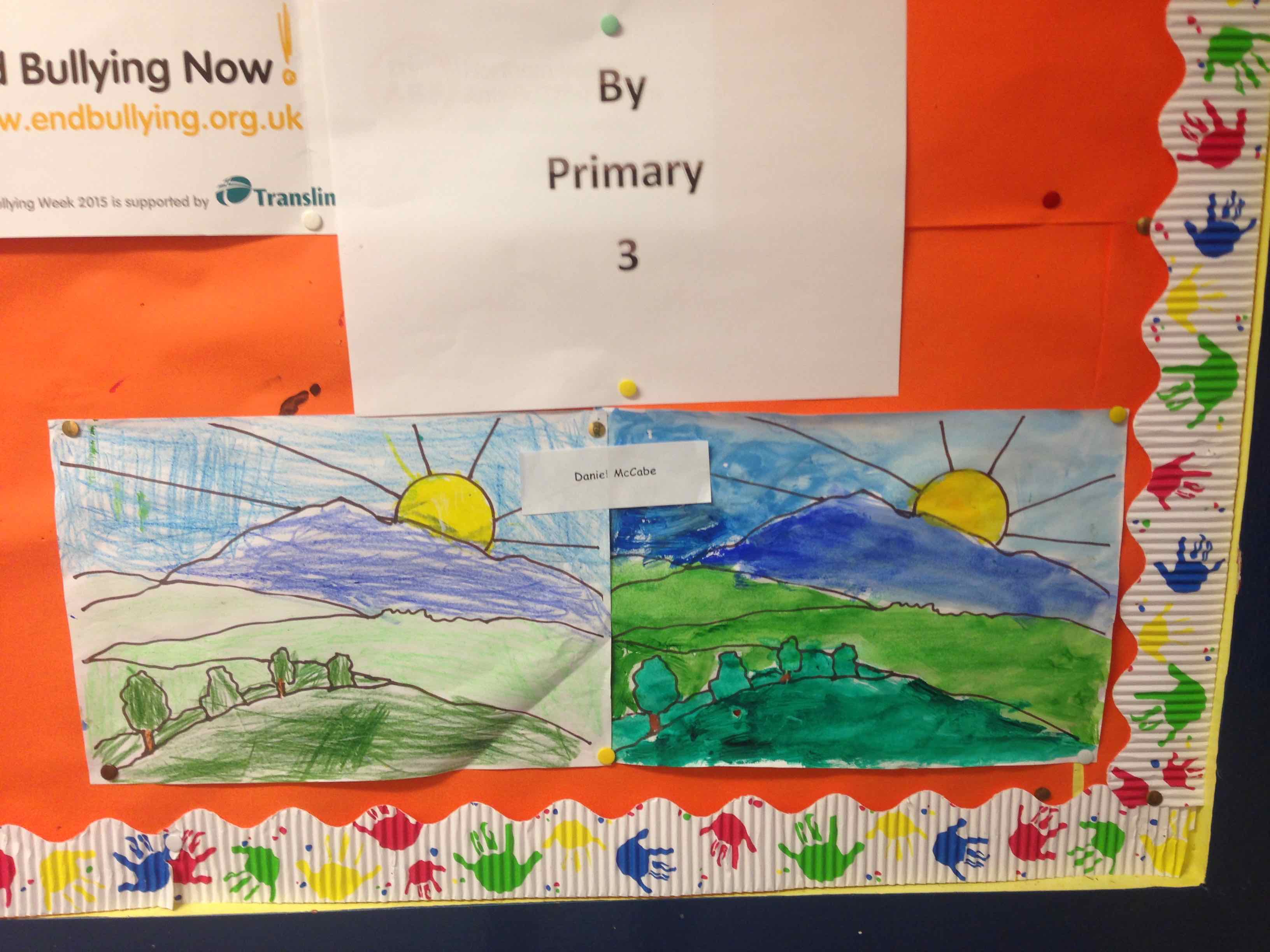
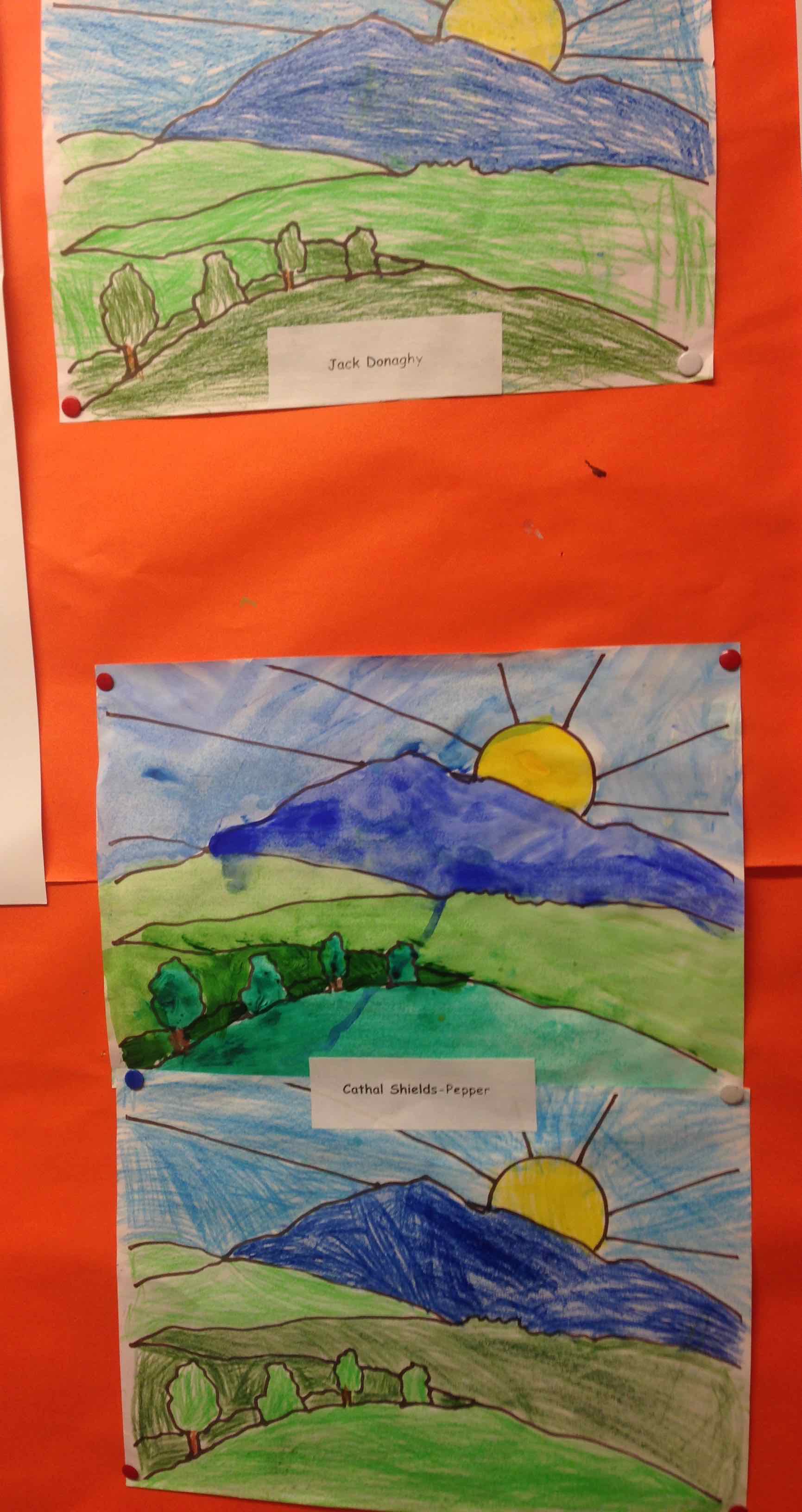
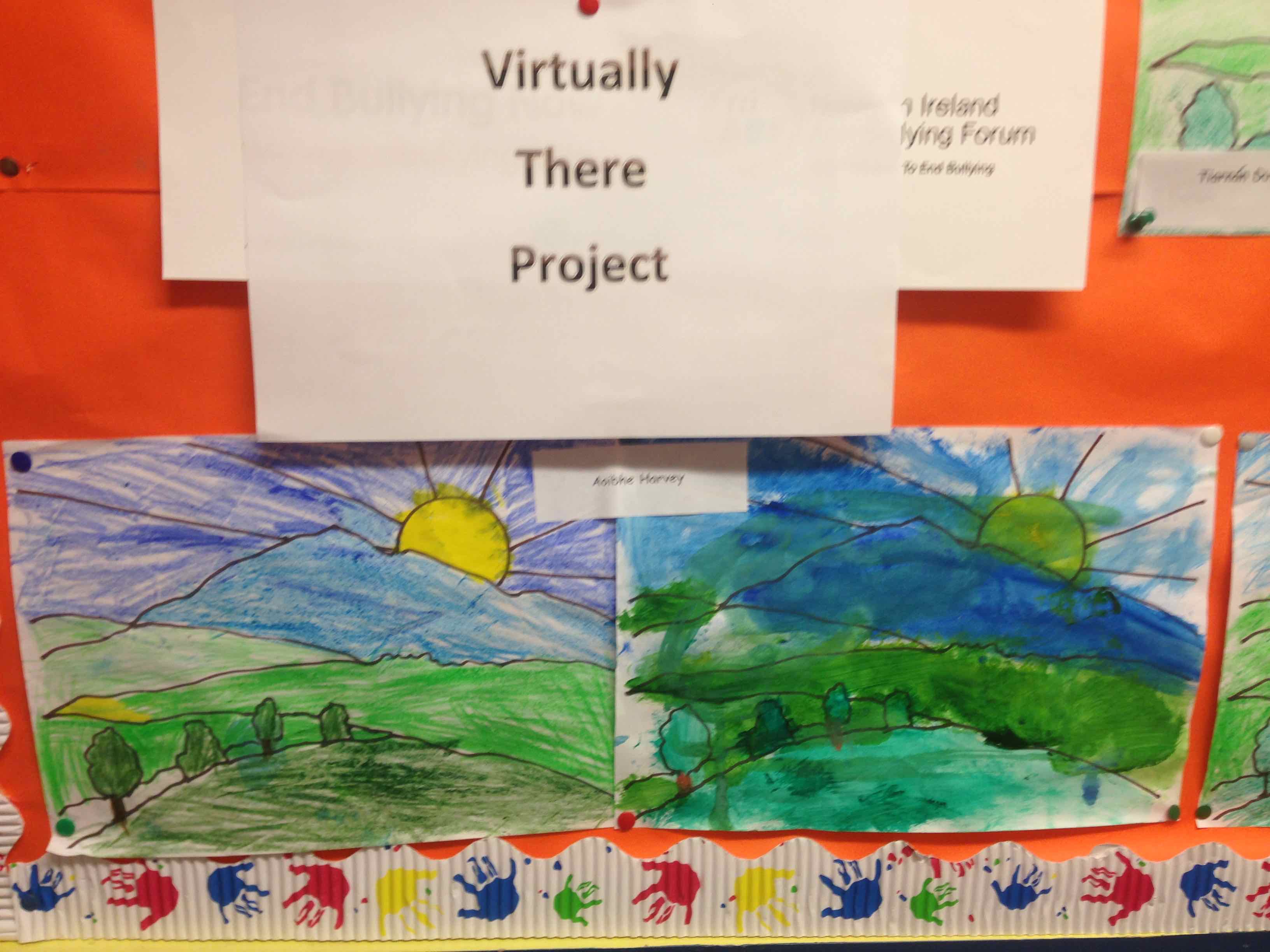
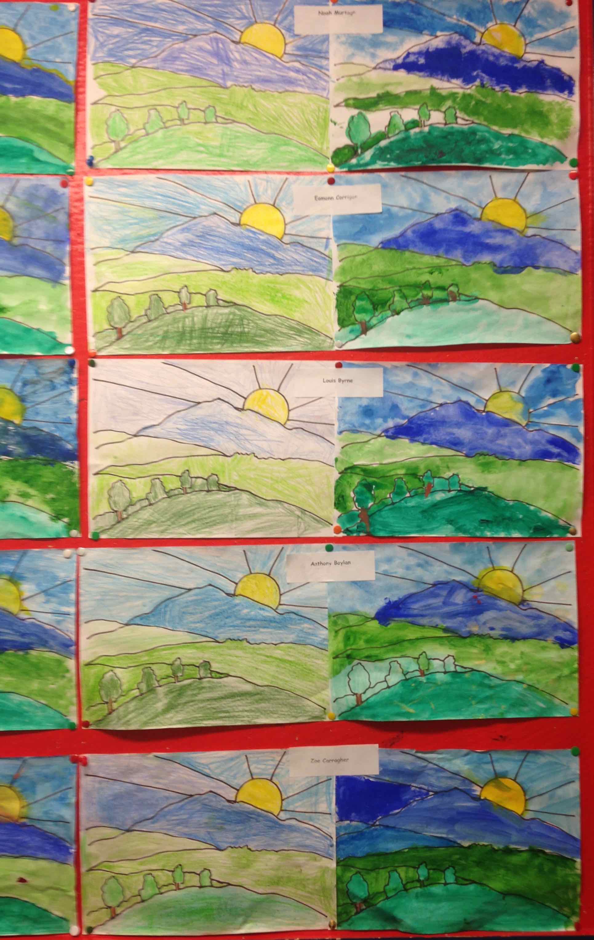
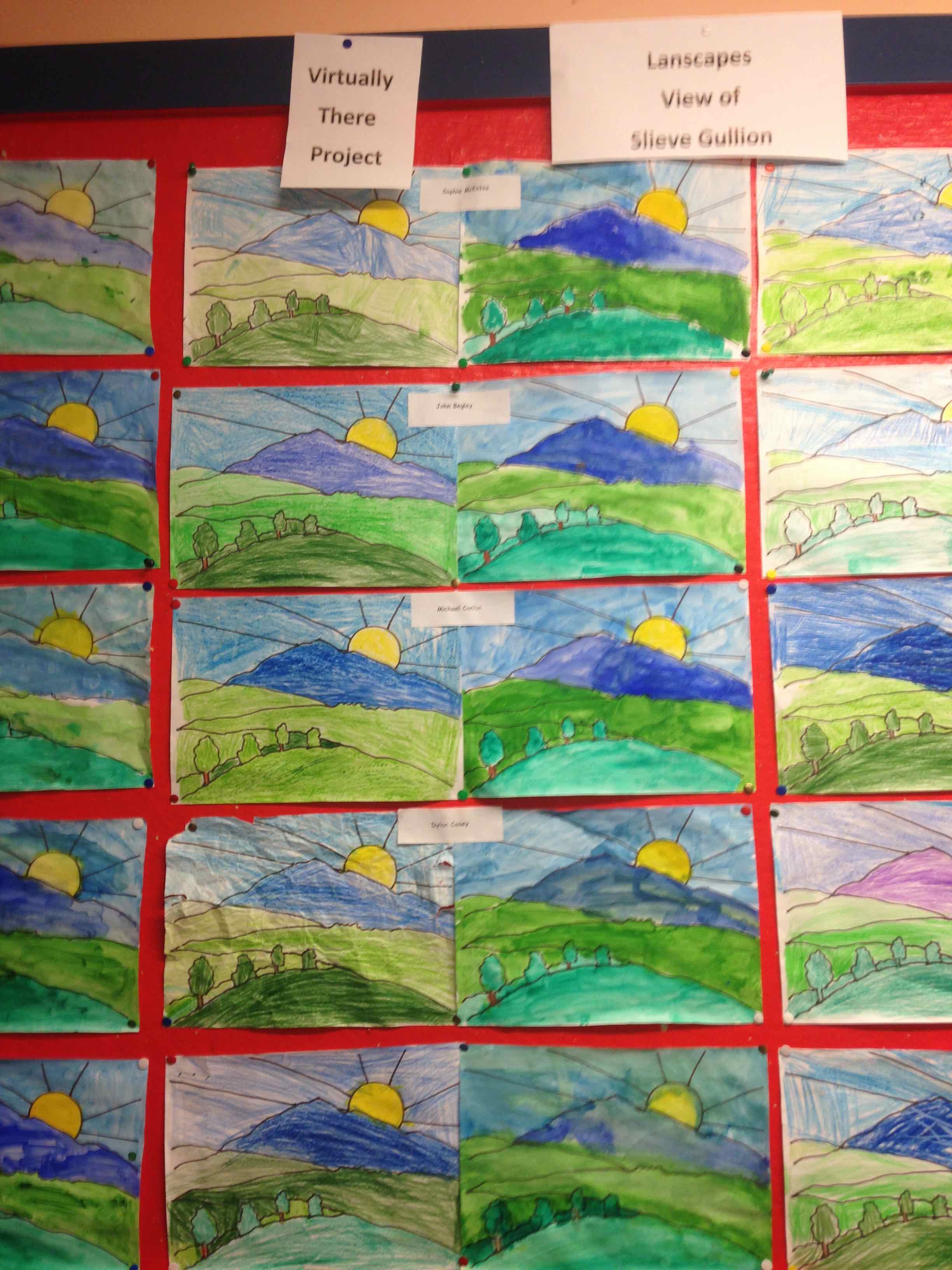
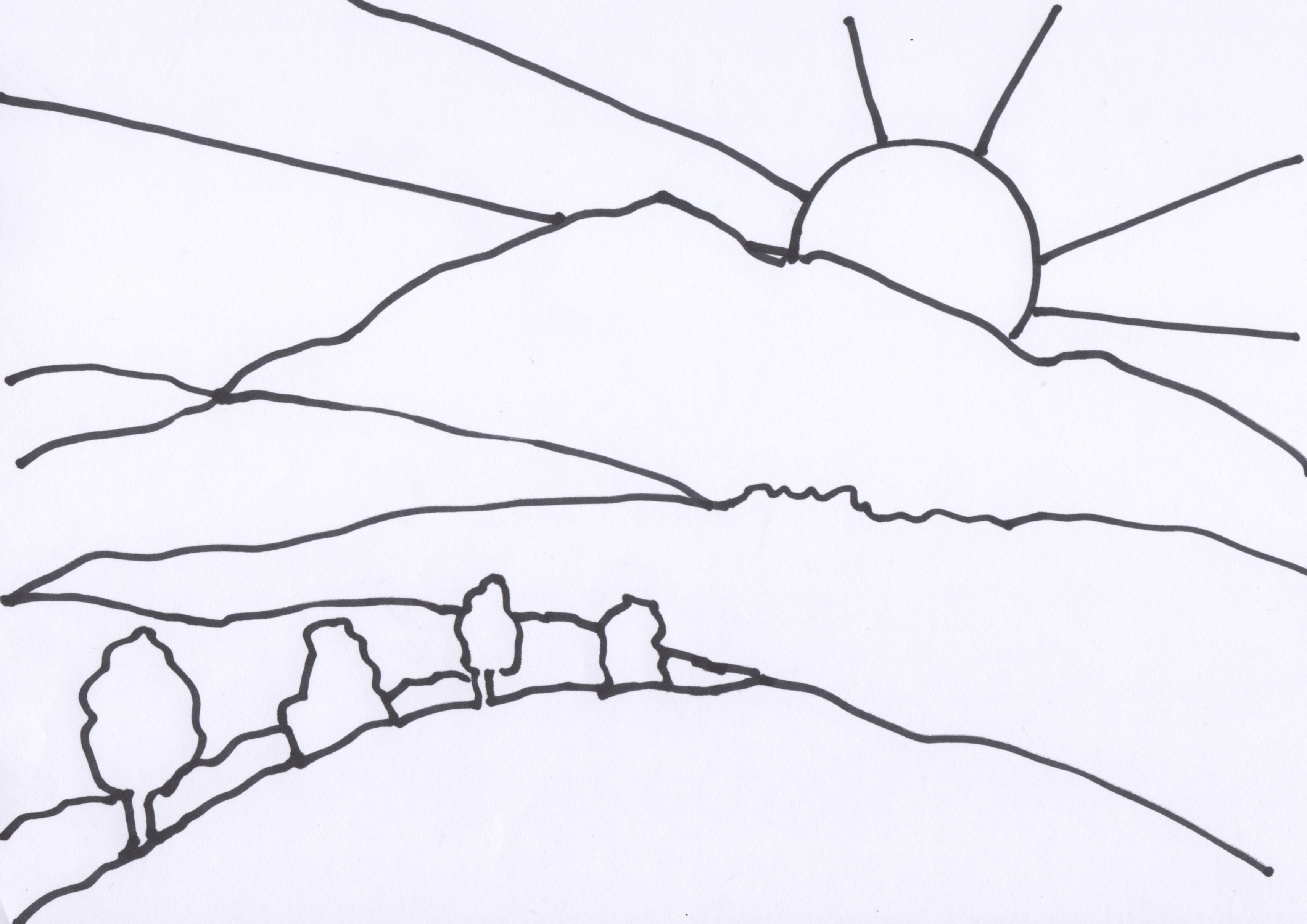
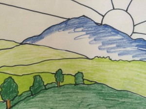
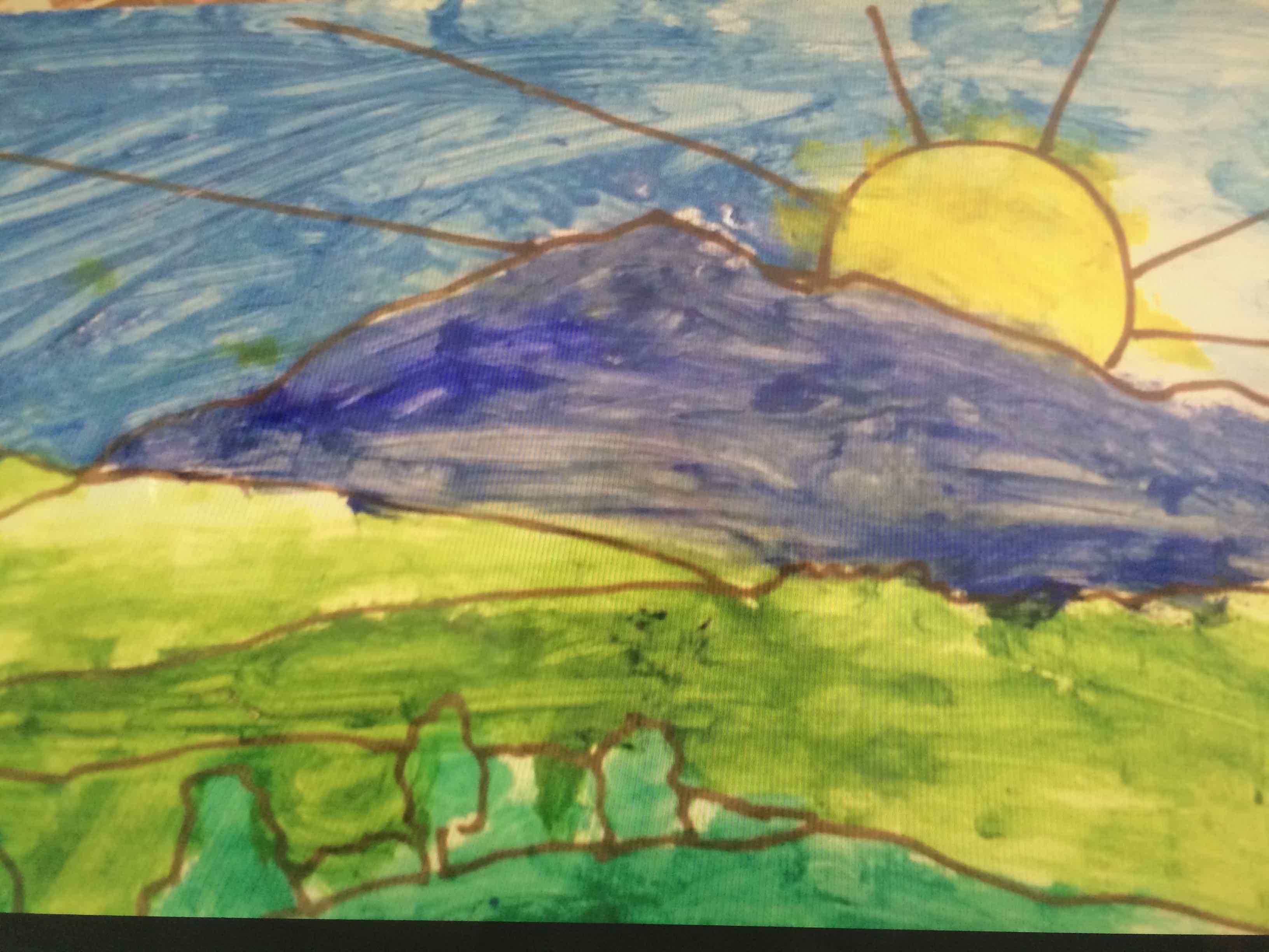
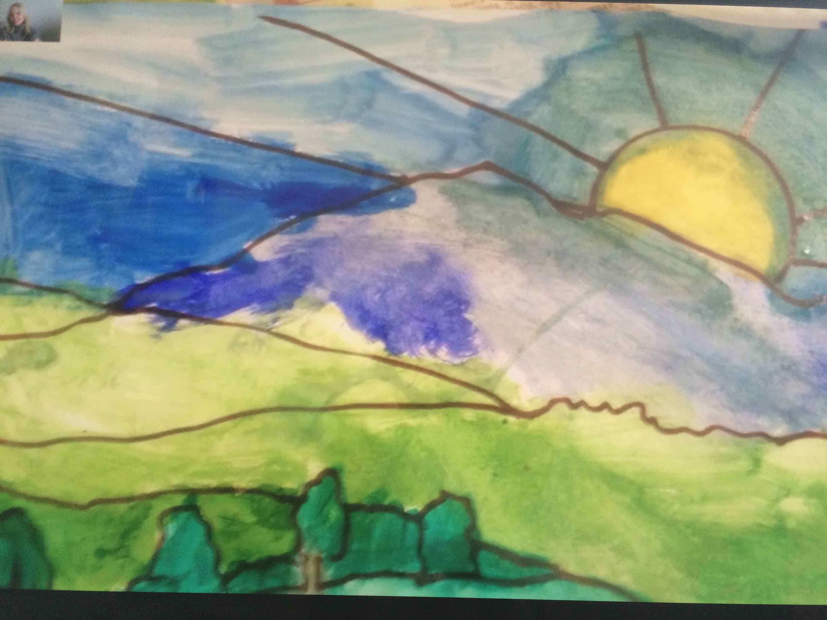
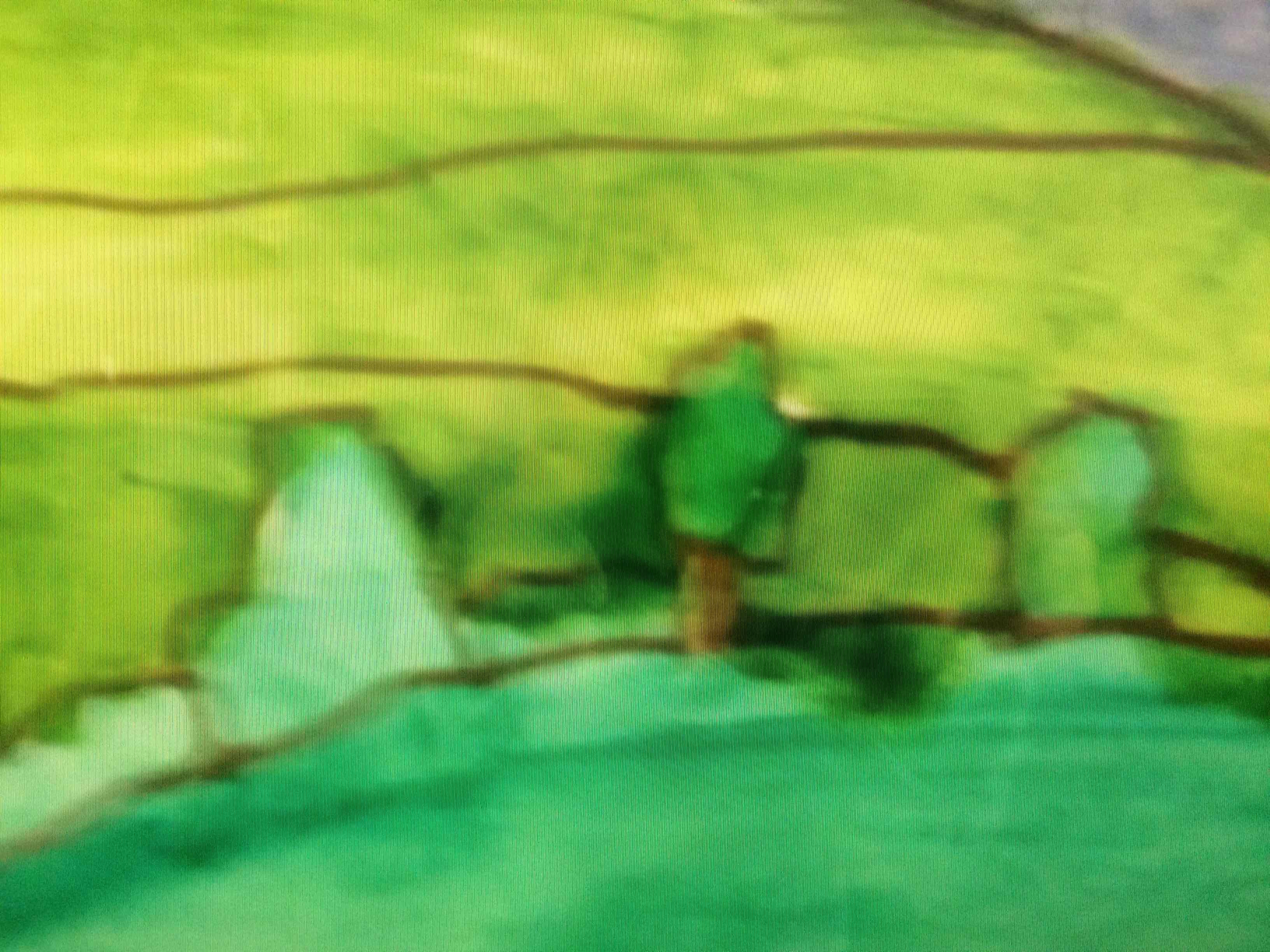
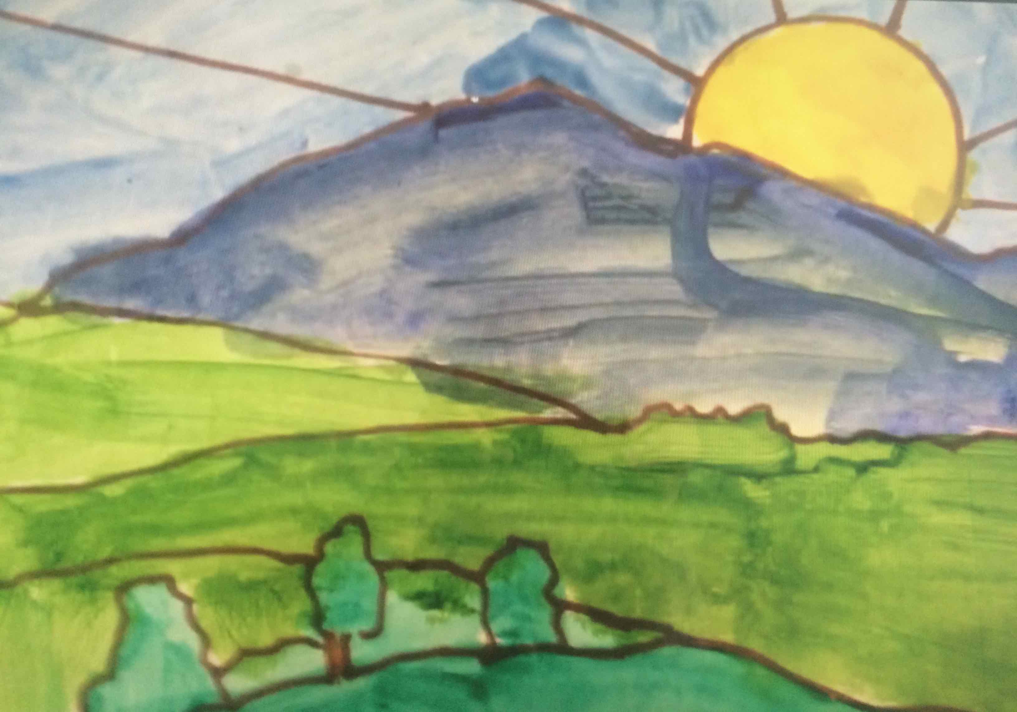
Mrs Hughes and I agreed to work with an image I had prepared and emailed through to the class to be photocopied twice for each child. The children were to colour these in.
Before we began we had a discussion about the picture itself and about the word CONTROL.
THE CHILDREN SAID:
Its a picture of mother nature…
Maybe it was made on an iPad app…
They didn’t think a child made it…
It was drawn from a photograph…
It was a picture of a sunset and a mountain…
Then we tried looking at the picture just as a collection of different shapes… how many shapes could we count? What sort of shapes were they? IRREGULAR we discovered!
And what does CONTROL mean? The children thought….”everything in its place”
“in charge’, “like a robot”, “by force”, “a remote control”
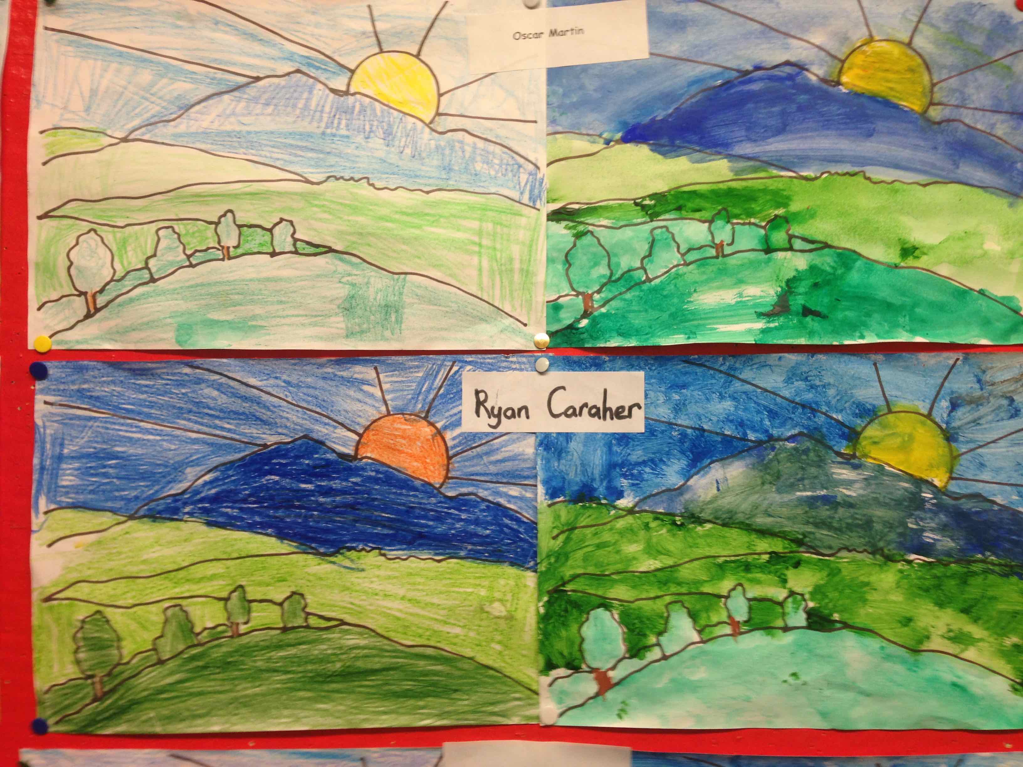
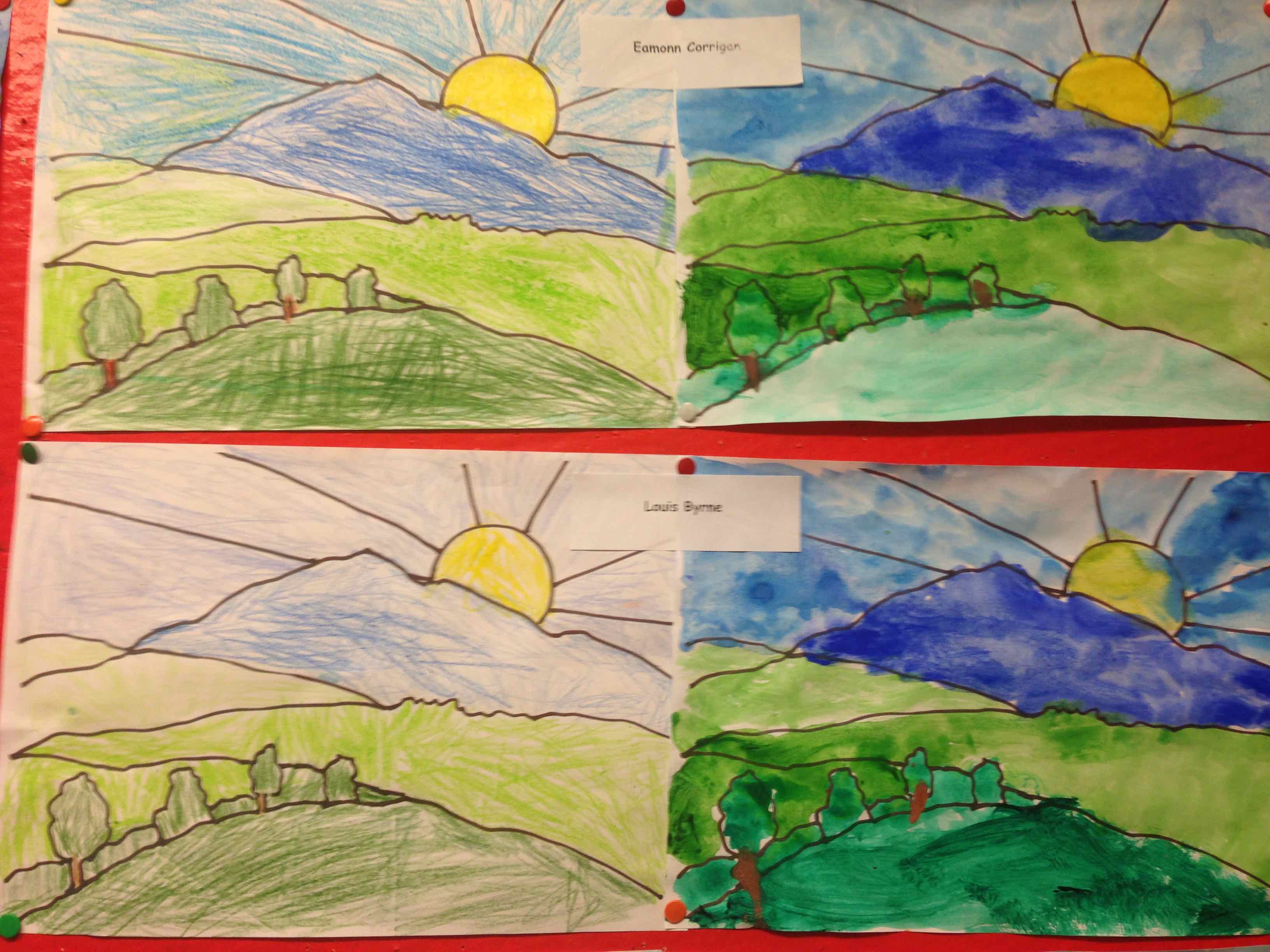
Mrs Hughes said that I was the REMOTE CONTROL because I was going to give the class a set of strict instructions to colour the picture in. They were NOT ALLOWED to choose their colours and they HAD TO colour in without going outside of the thick black lines of each shape. So we began …
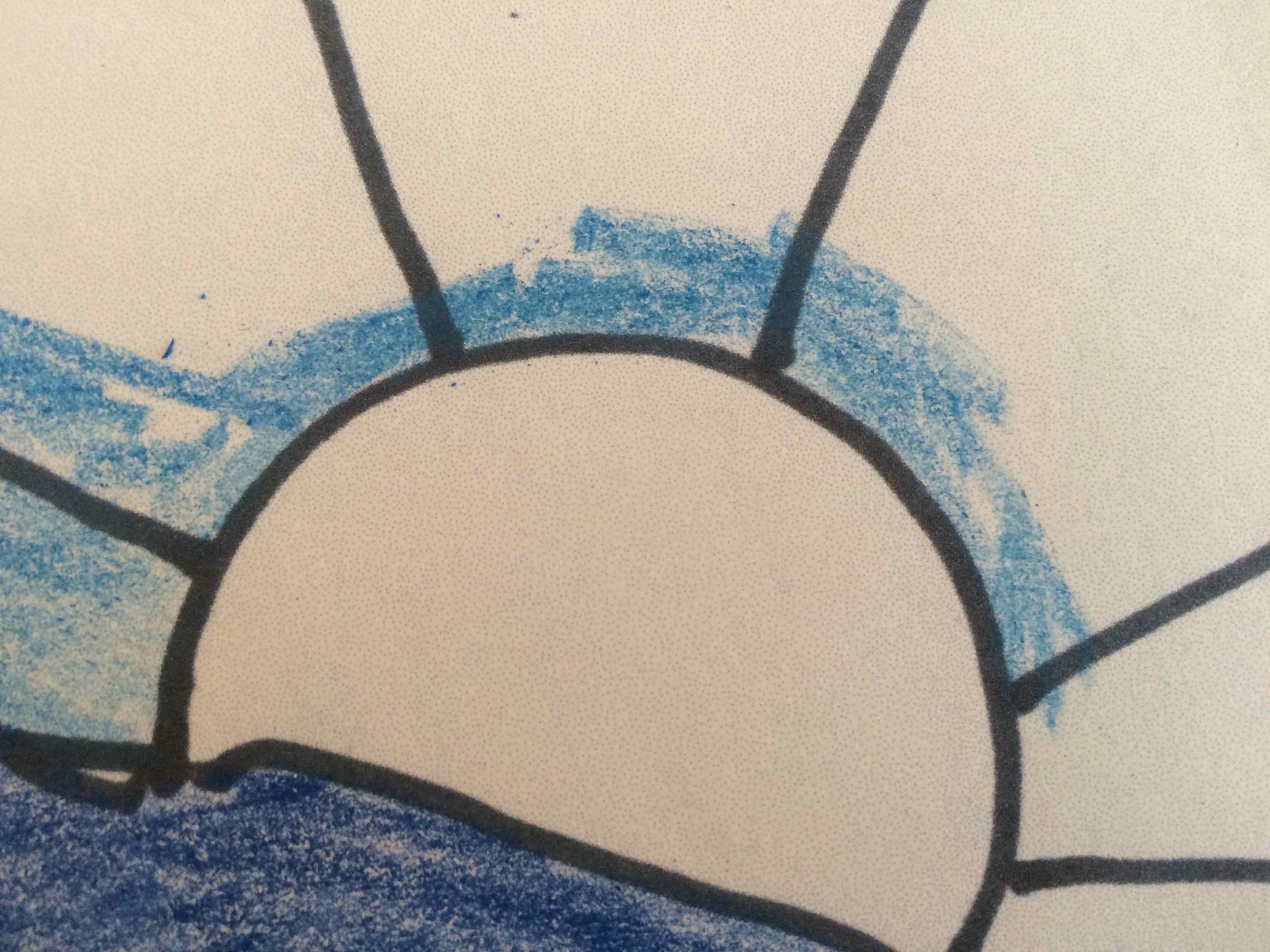
First dark green, then light green, then light and dark blue….. vary the pressure used to go lighter on the page…
All the time I was reminding them REMOTELY to KEEP CONCENTRATING and DO NOT TALK!
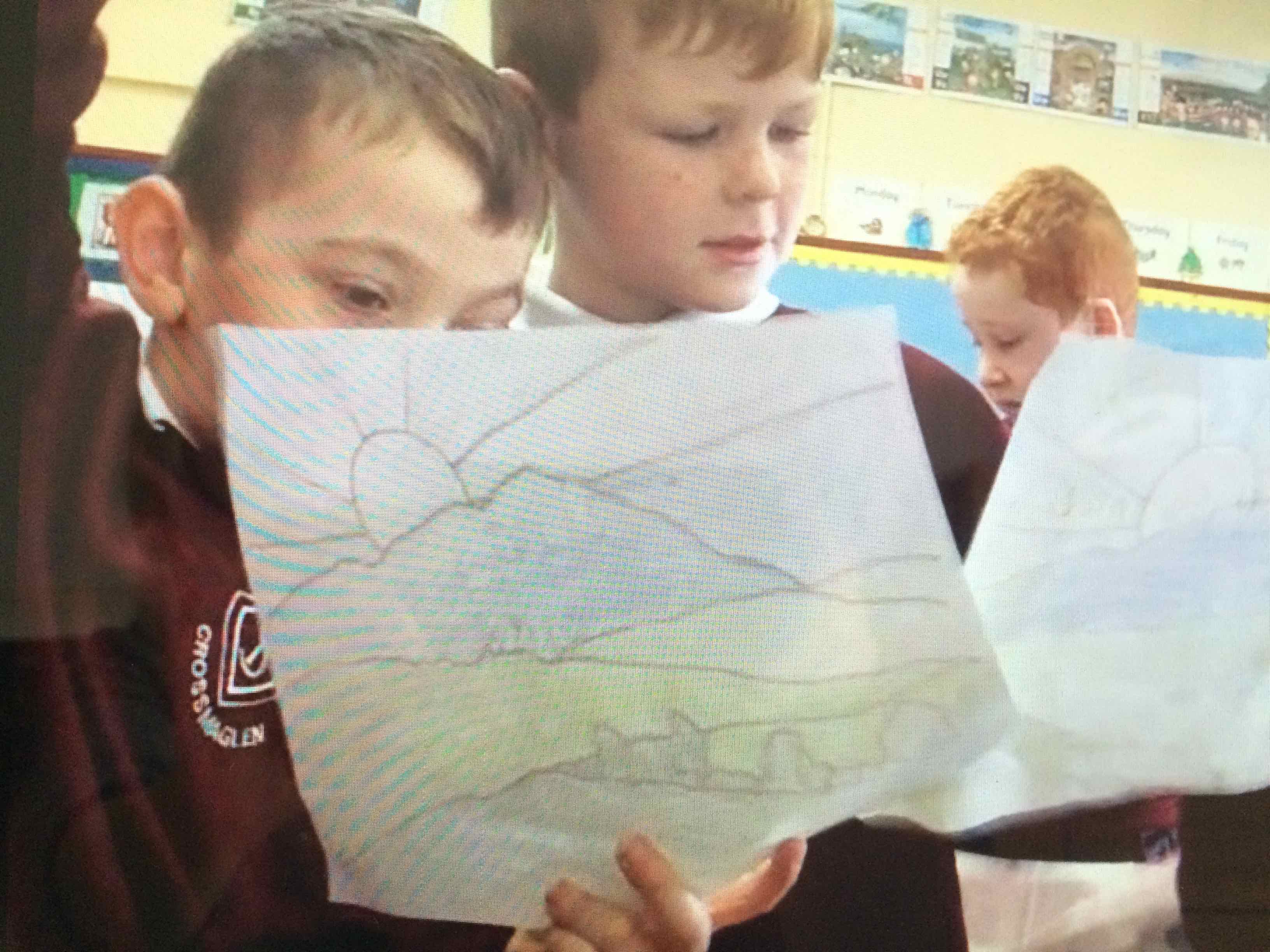
There was a bit of complaining going on that it was hard work!

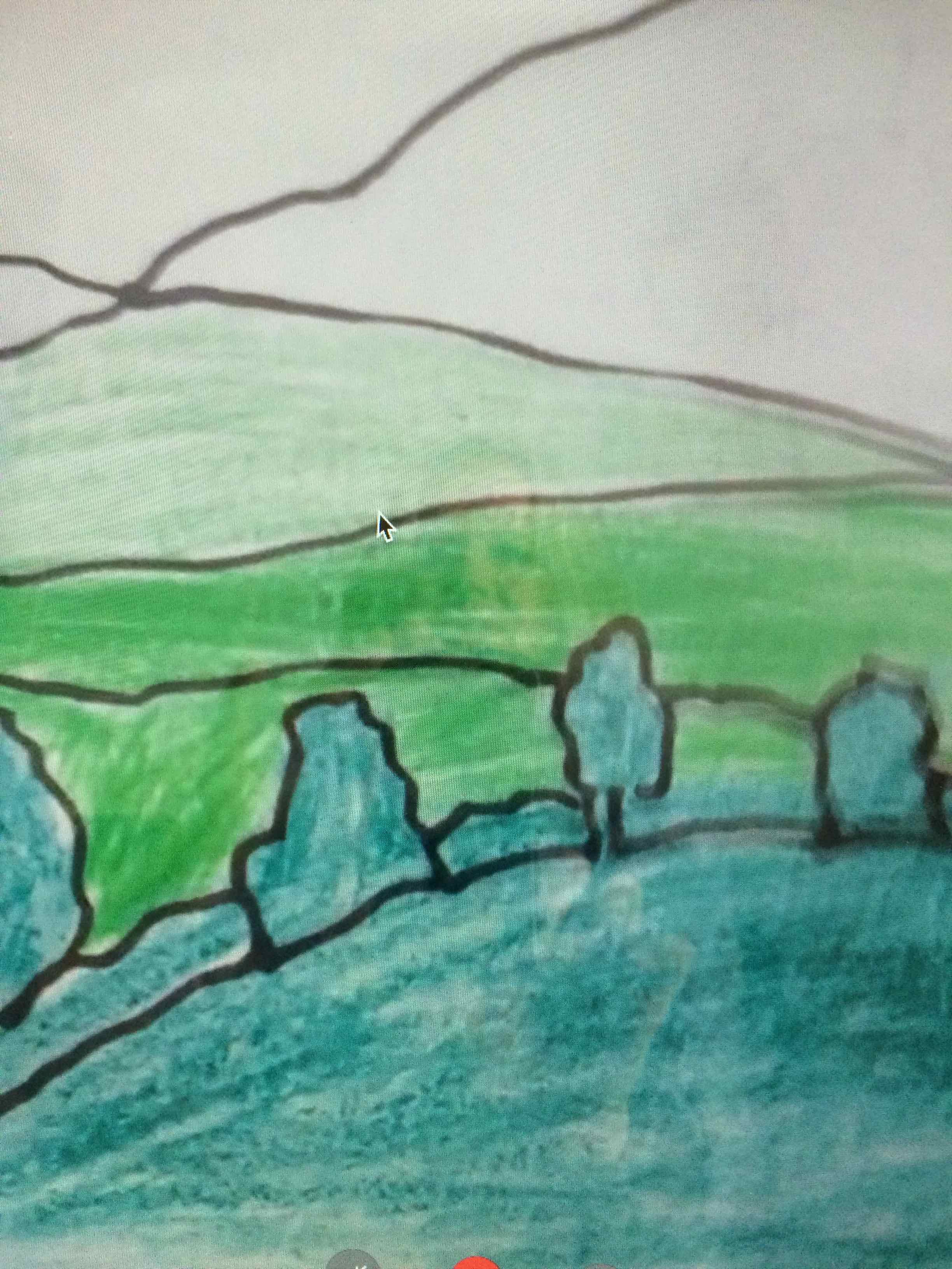
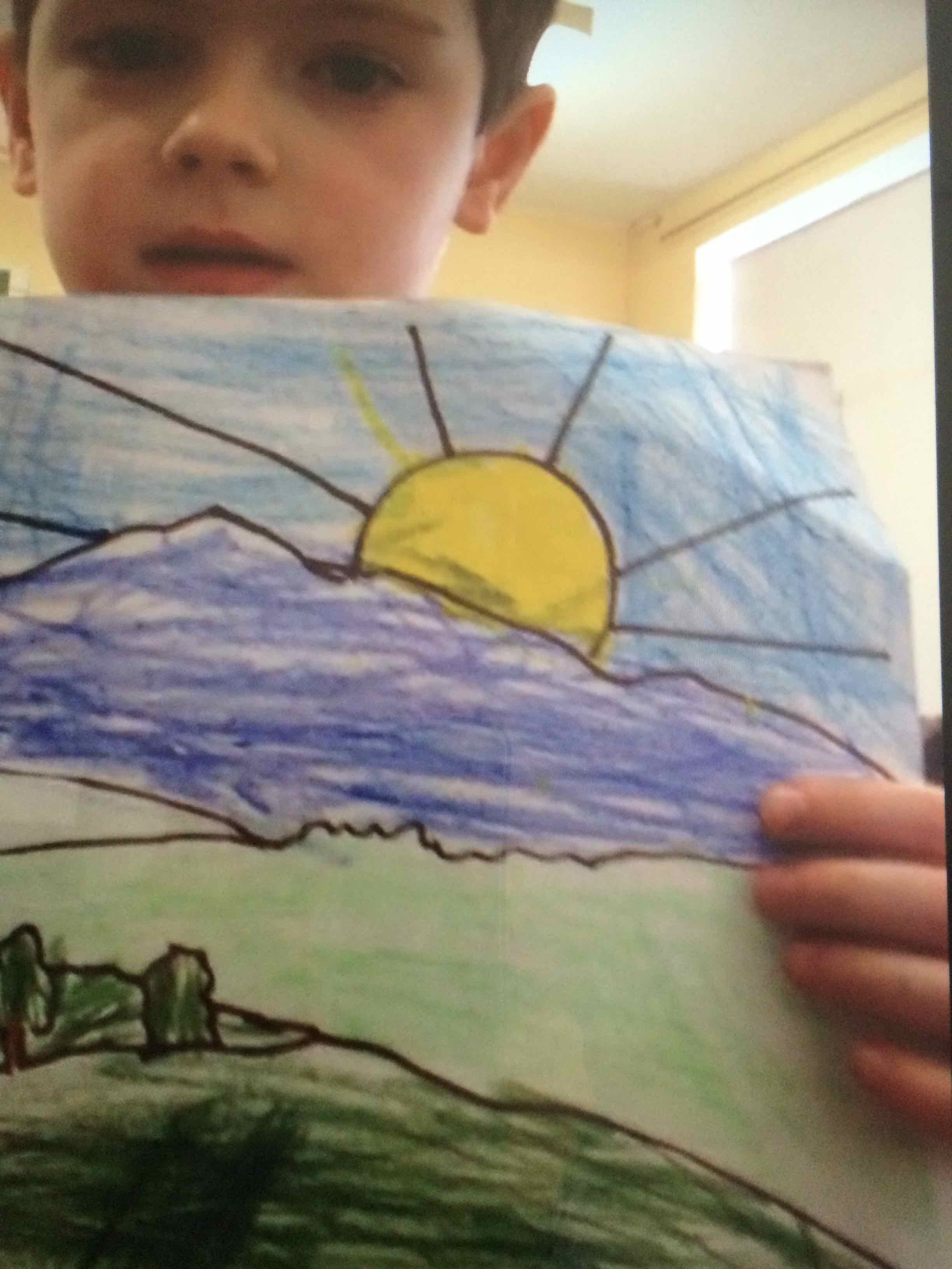
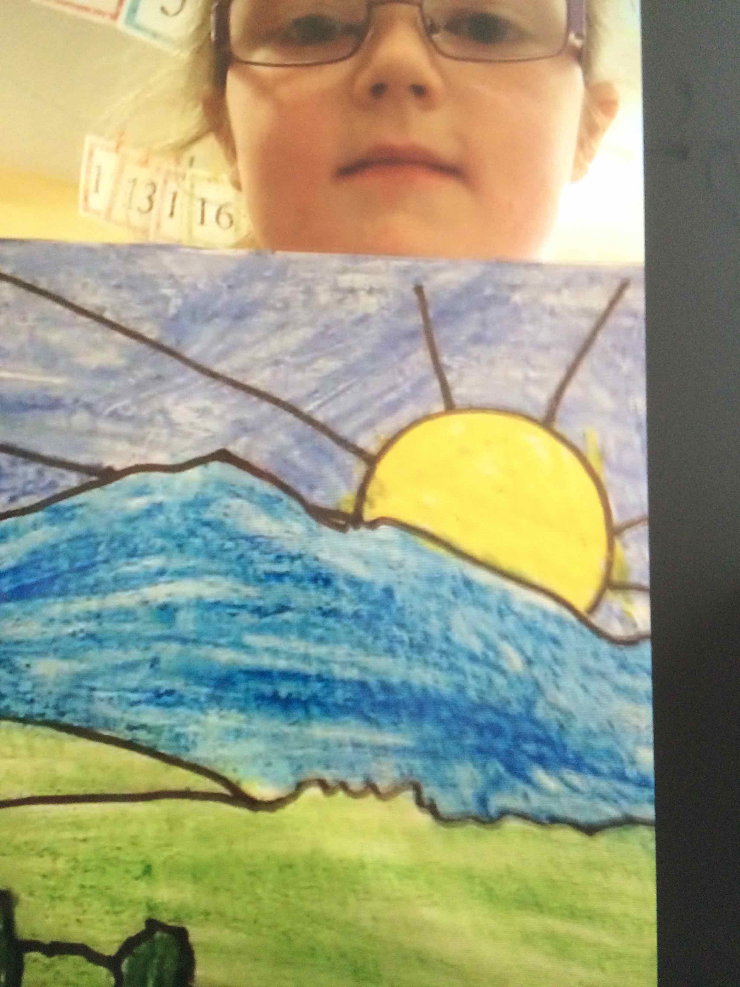
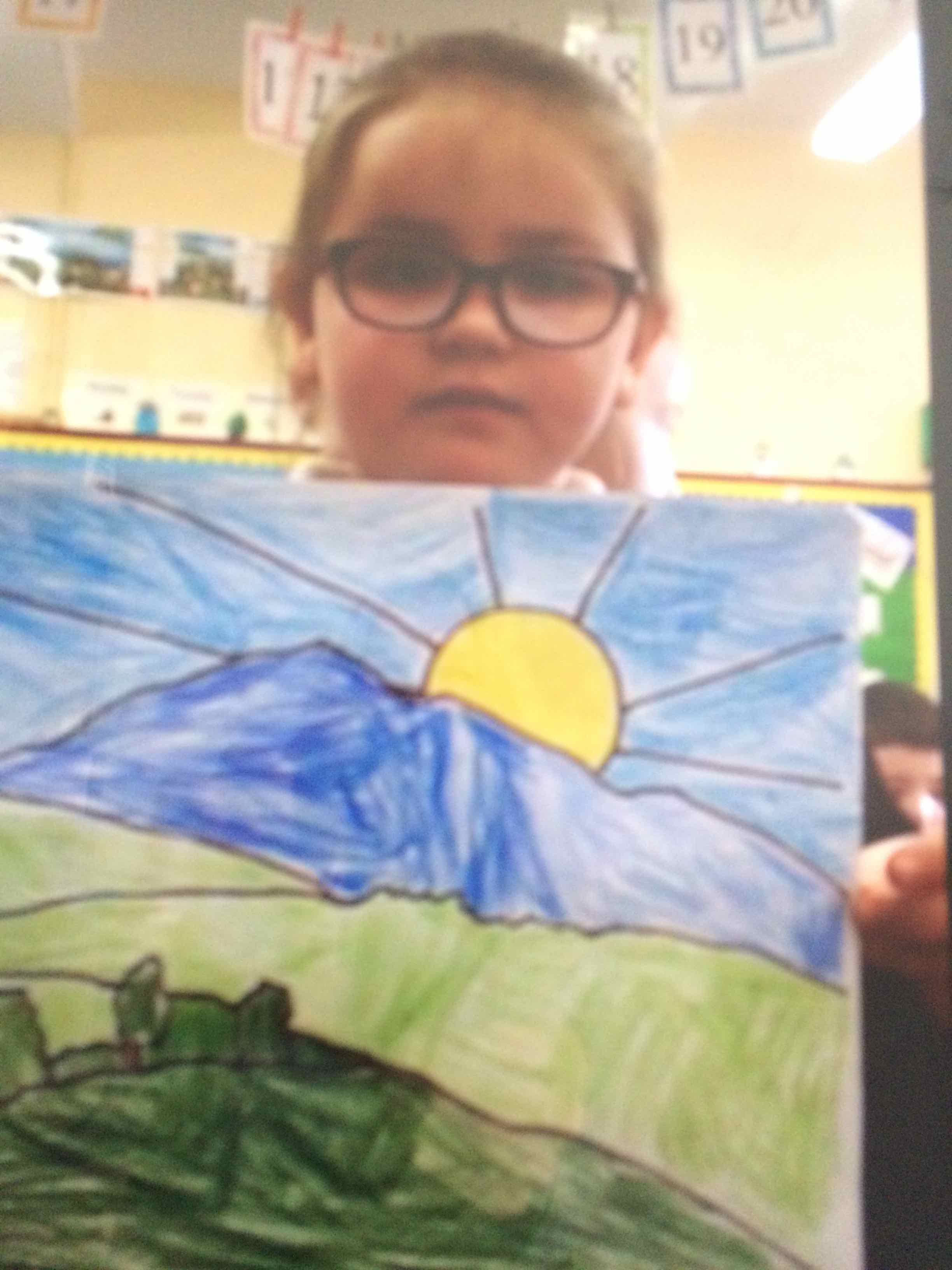
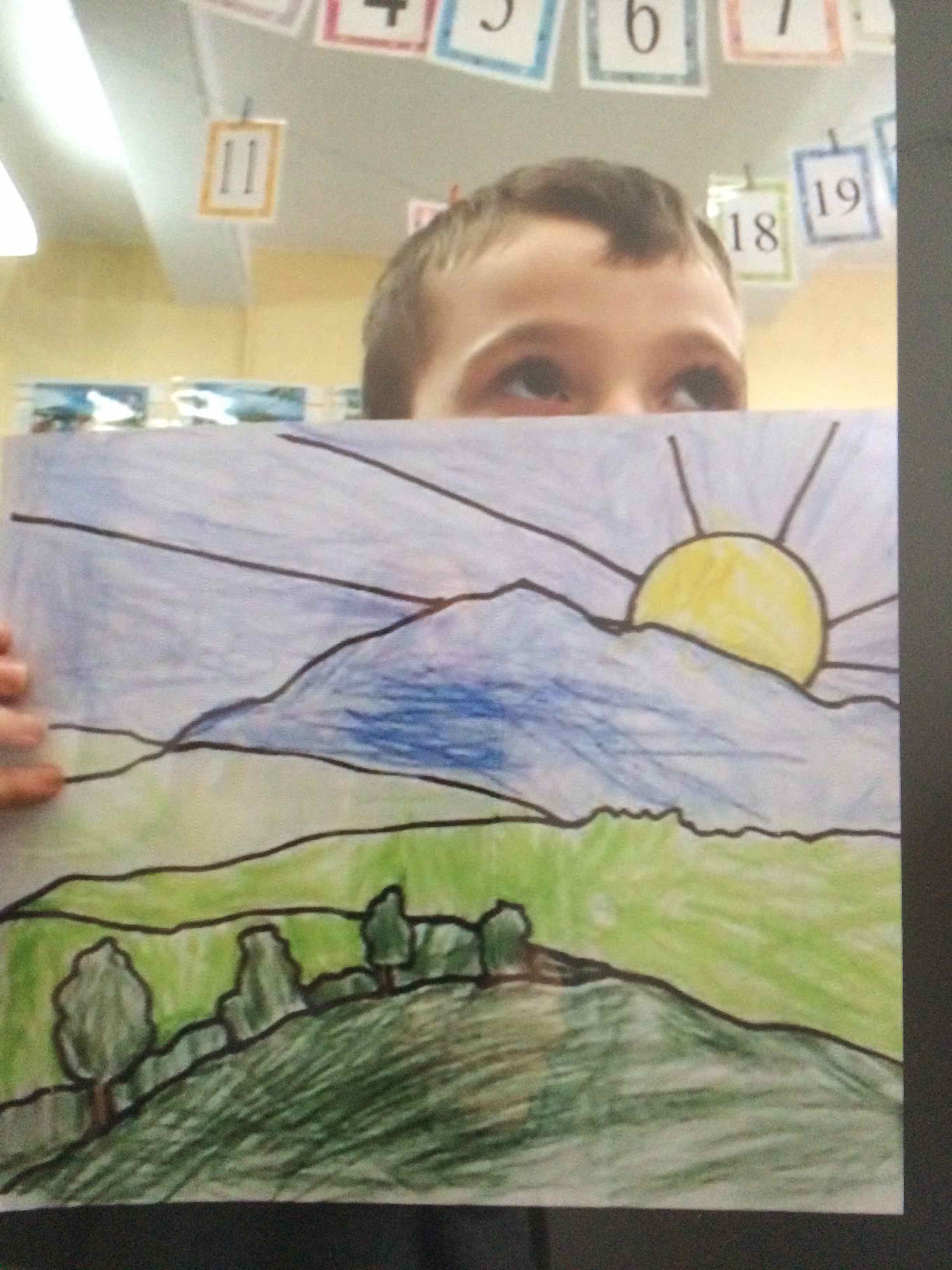
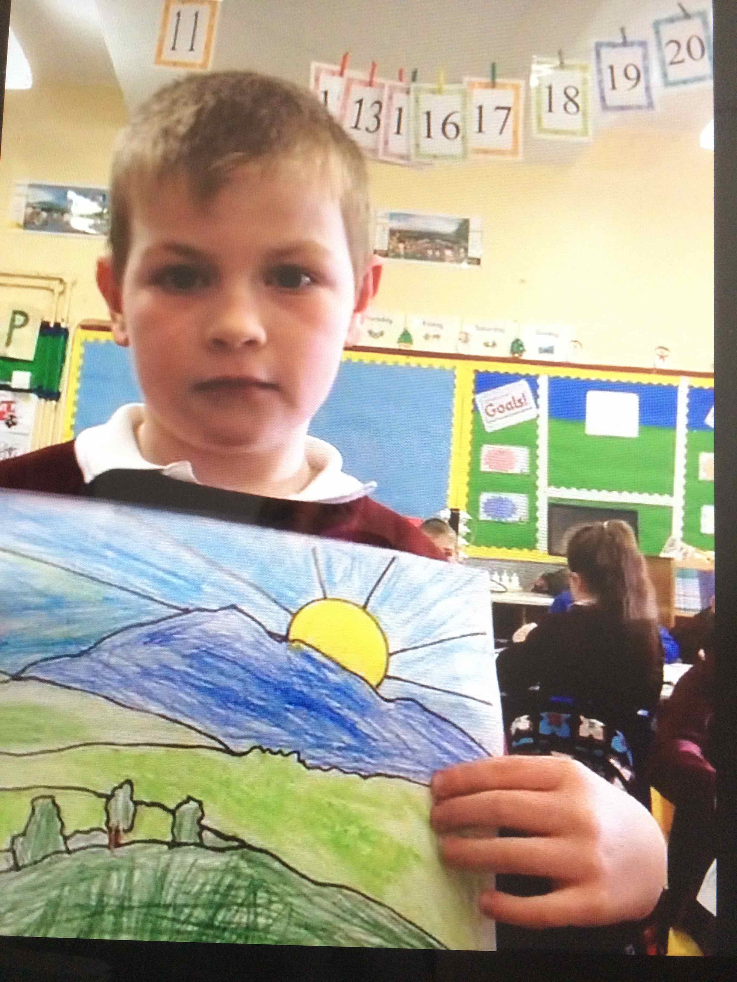
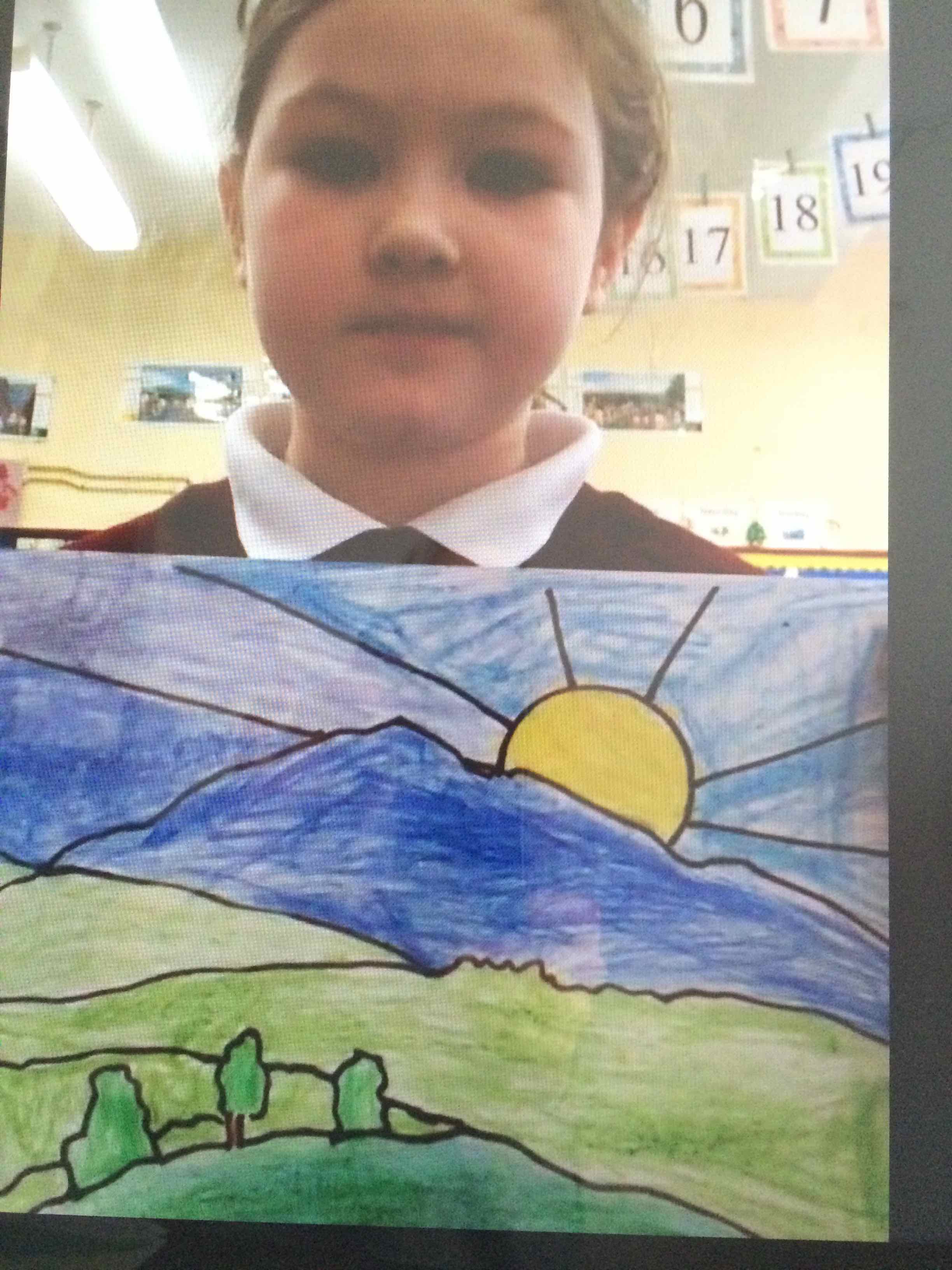
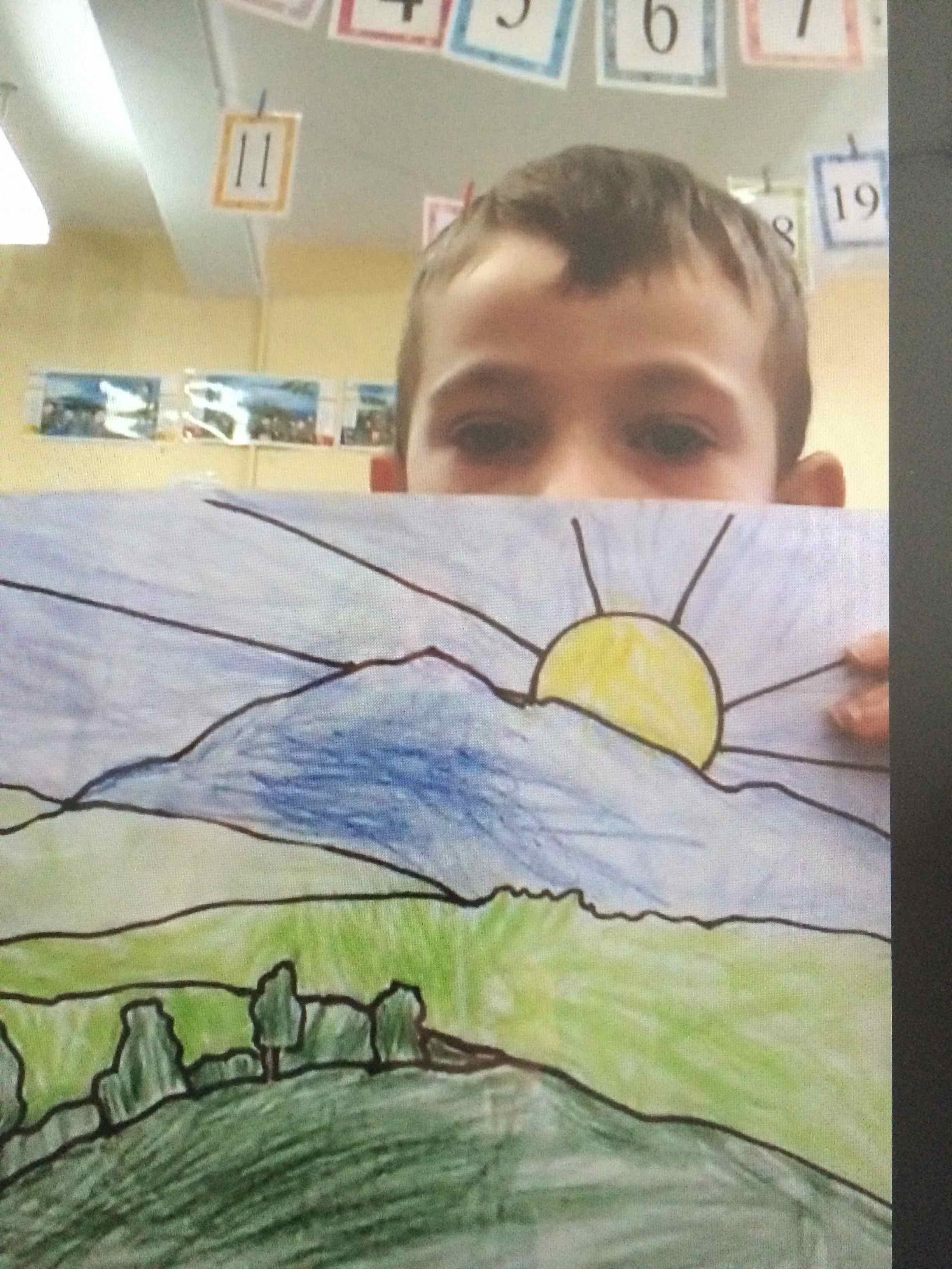
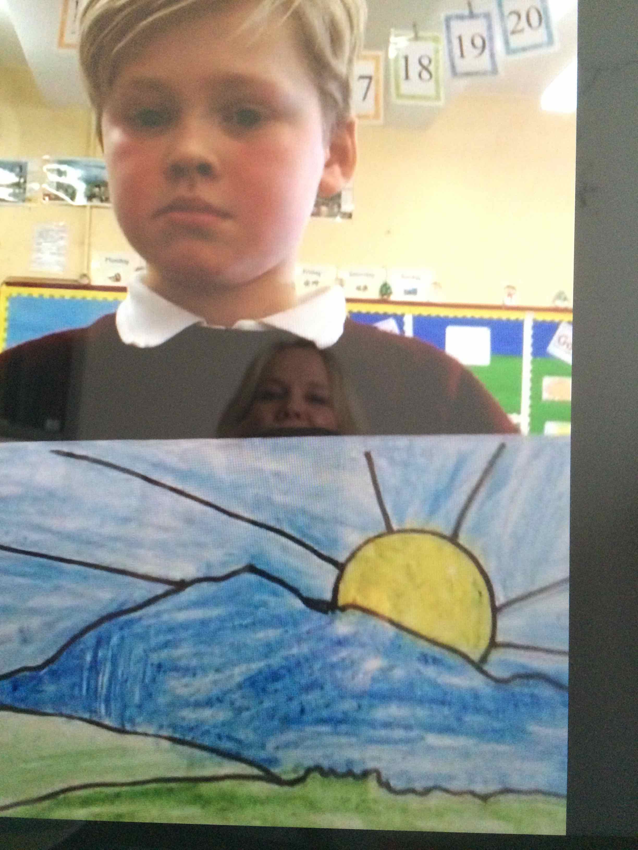
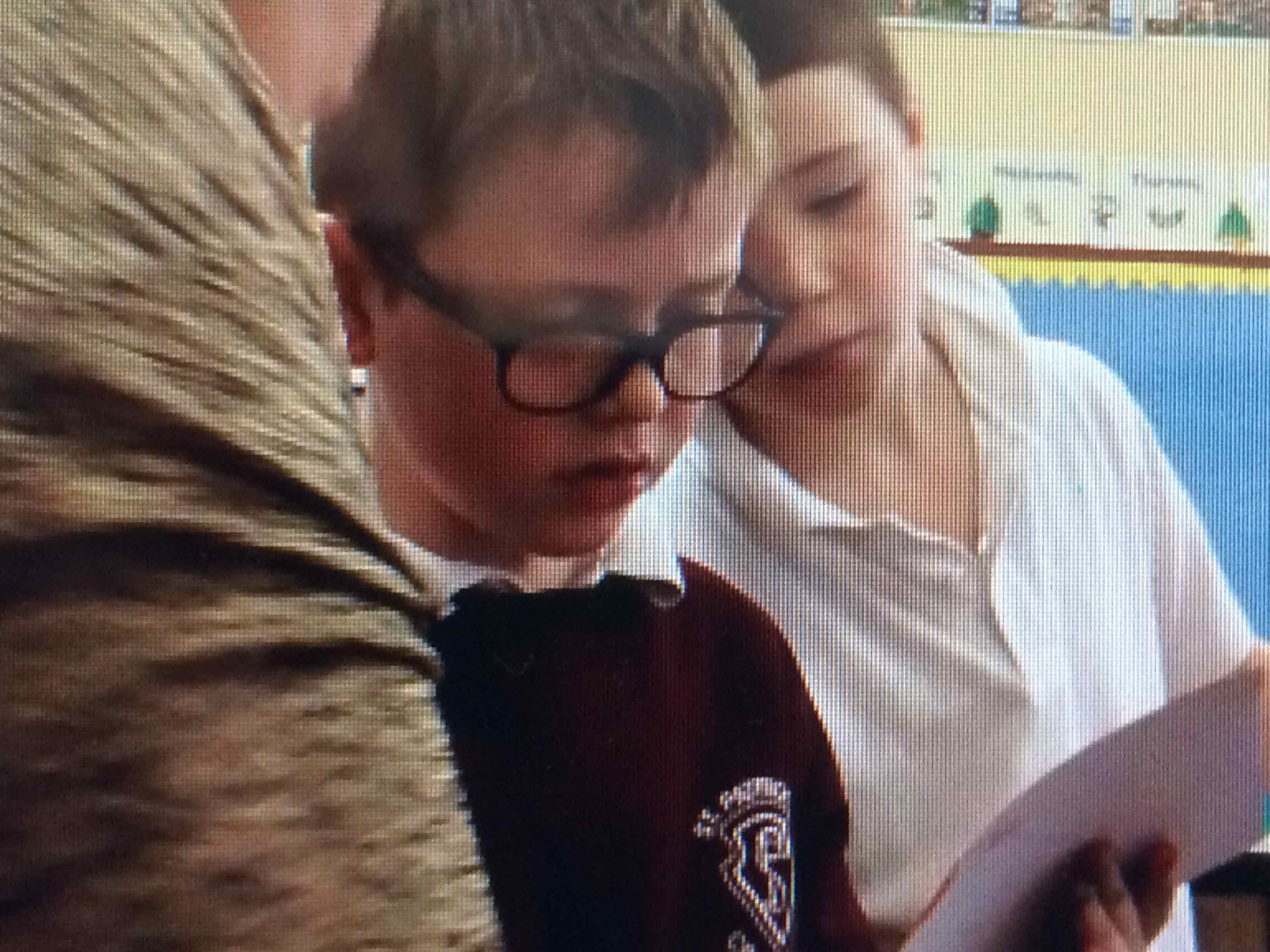
Actually it was really hard work! Some children said it was difficult to stay inside the lines. The children showed me their work… I am not sure that these are the happiest faces holding up their pictures? Do you think they look a little grumpy?
Then I showed them my work…

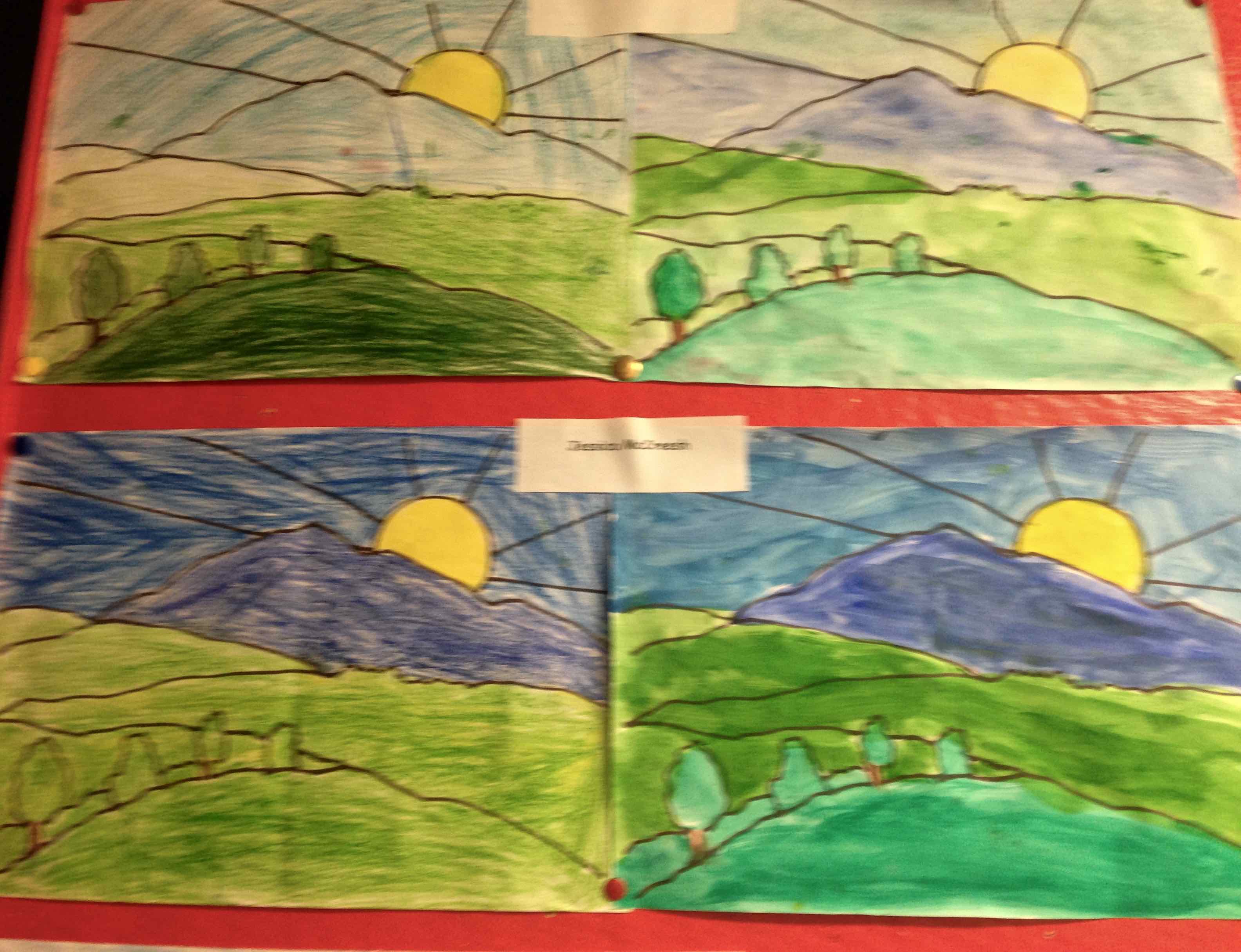
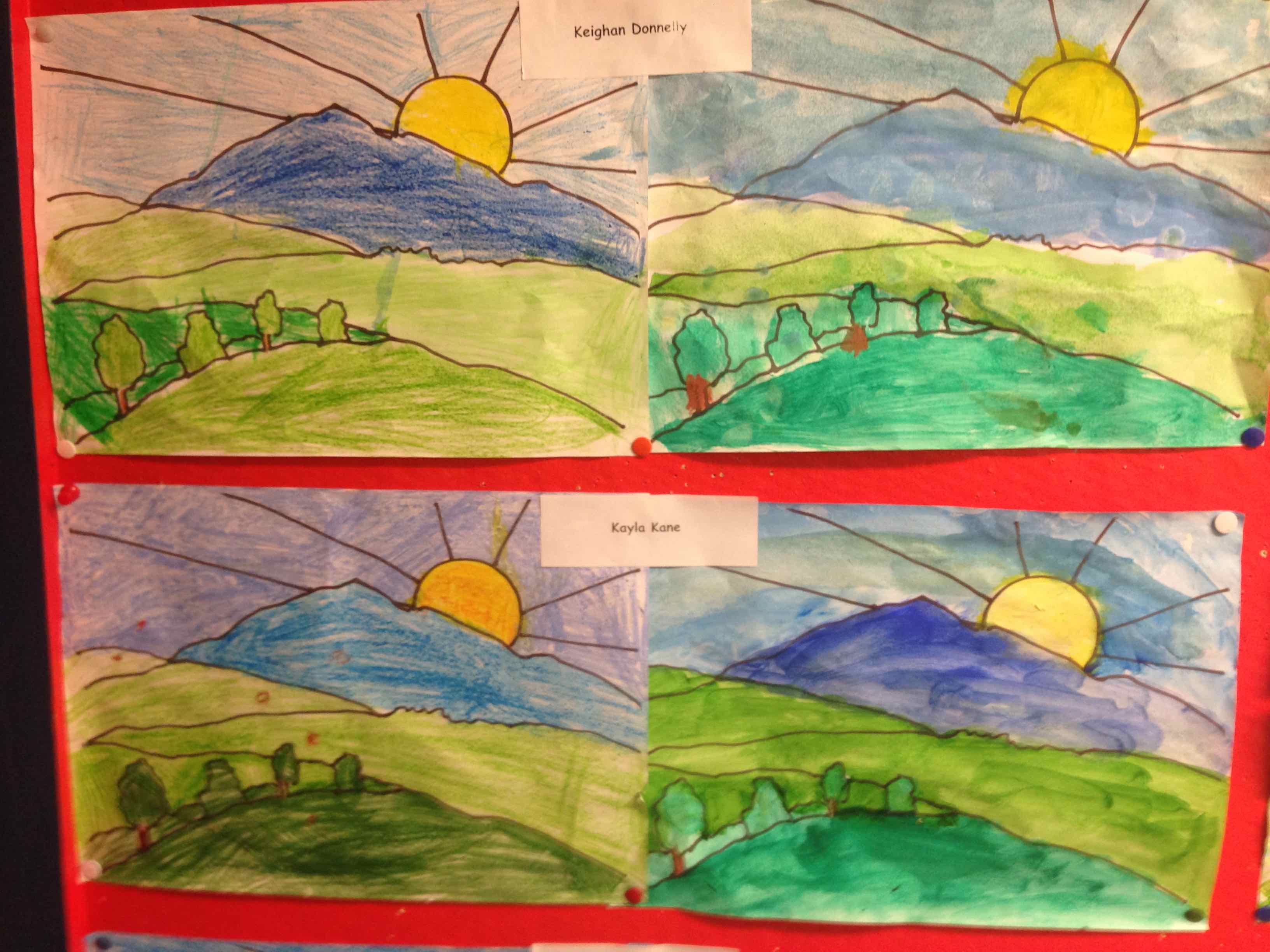
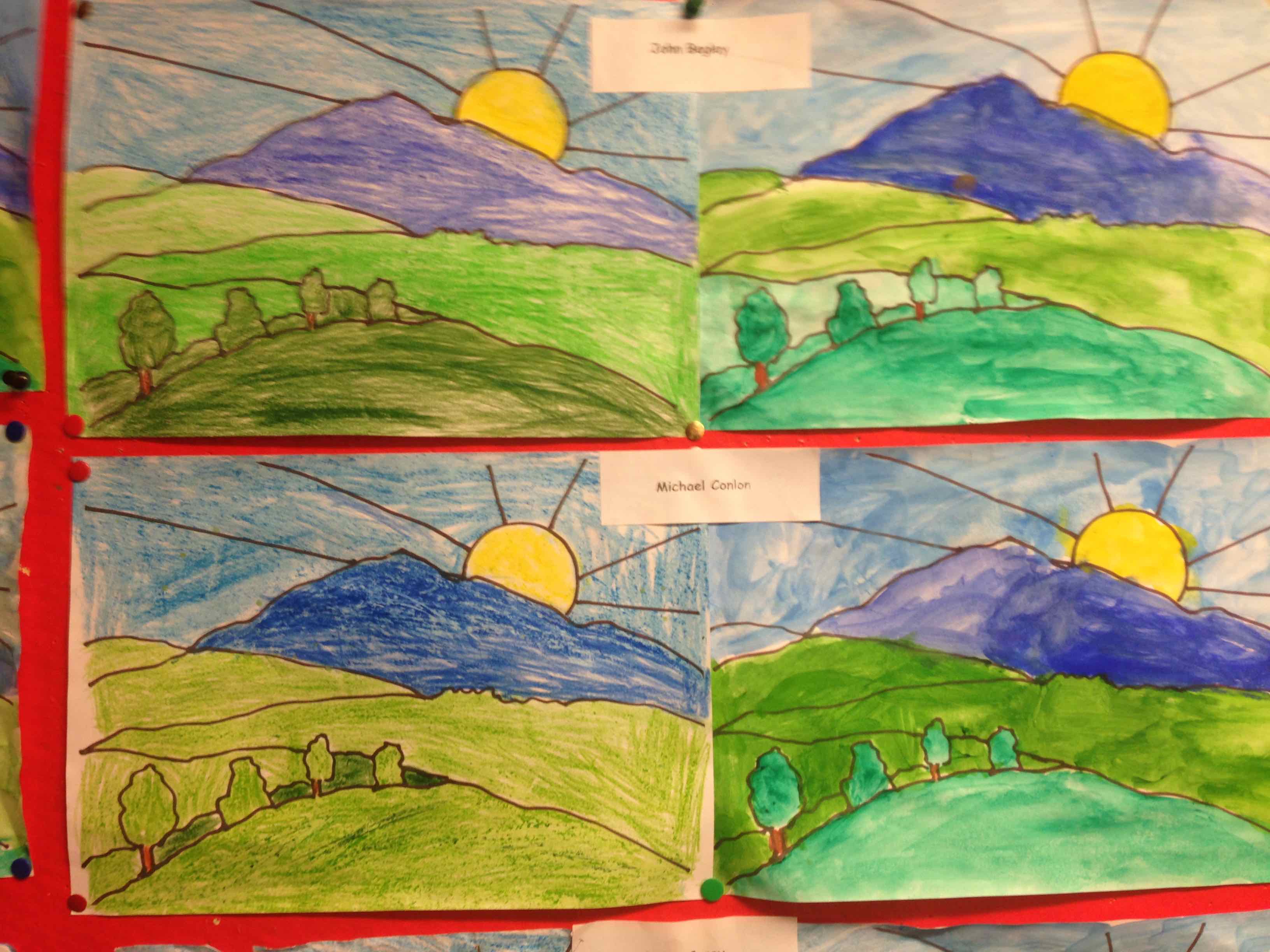
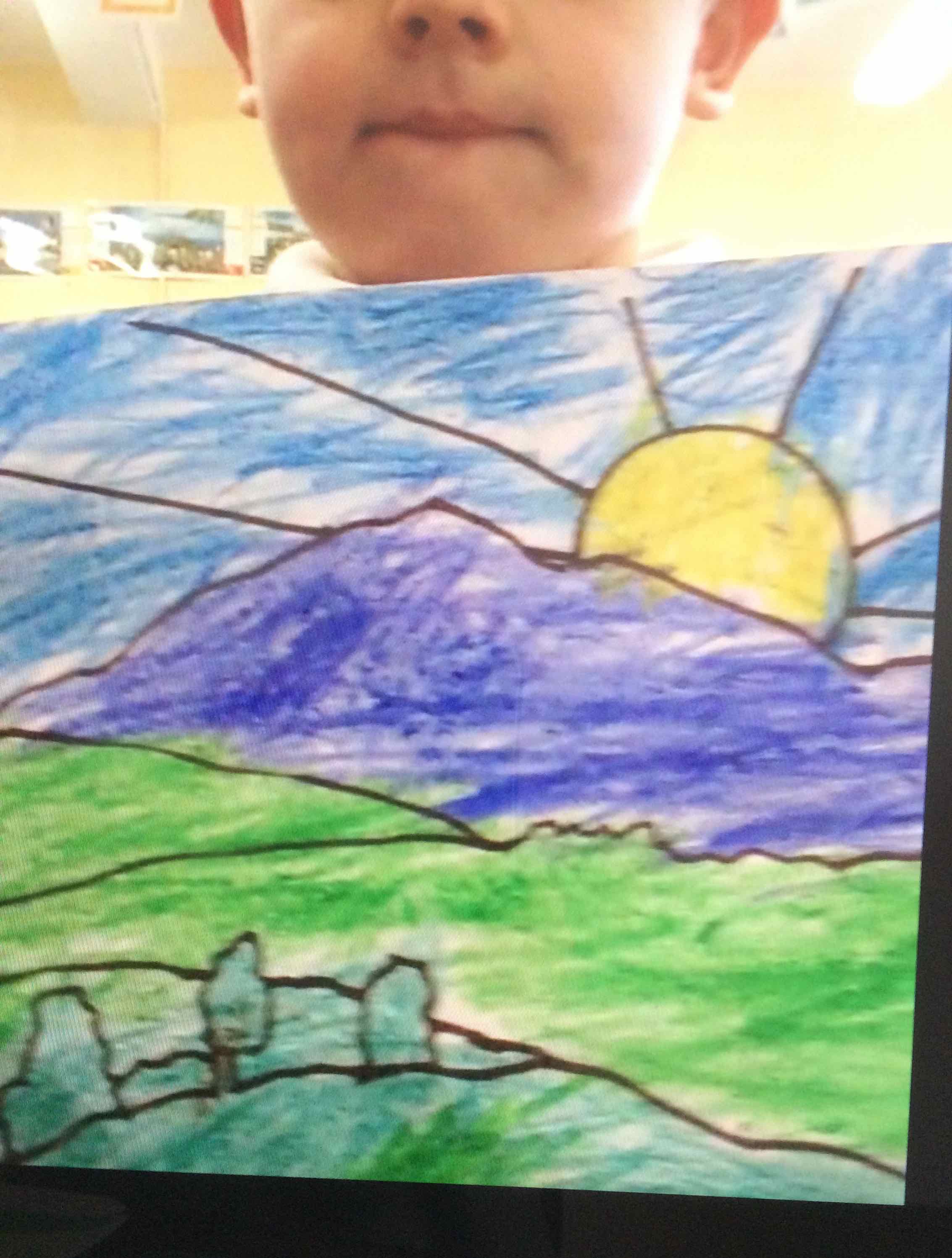
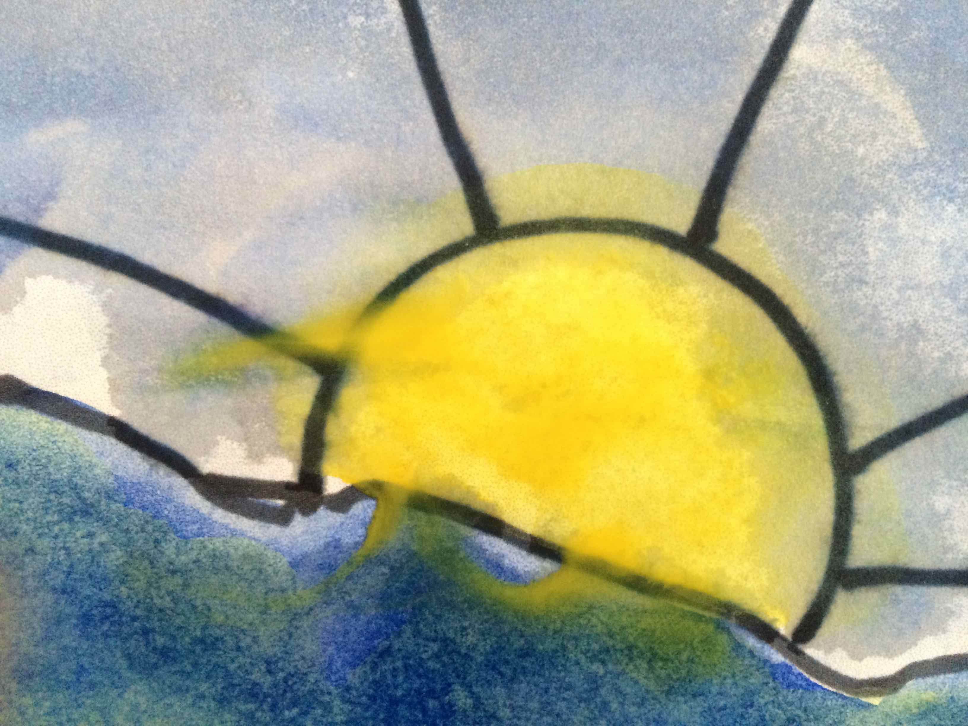
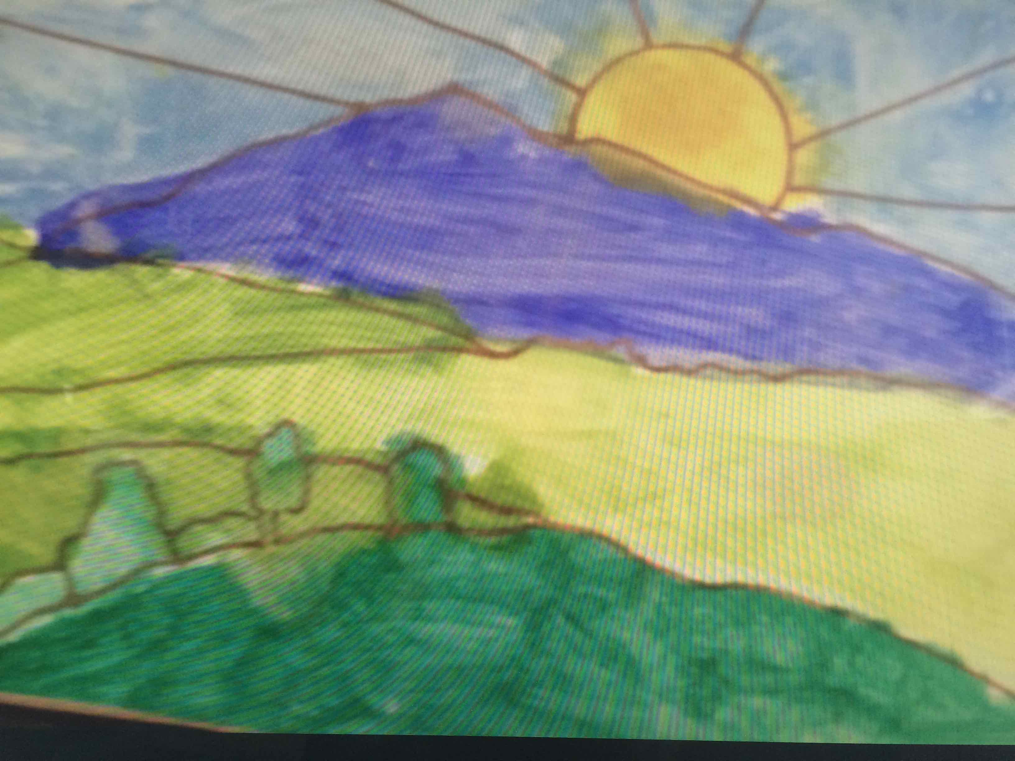
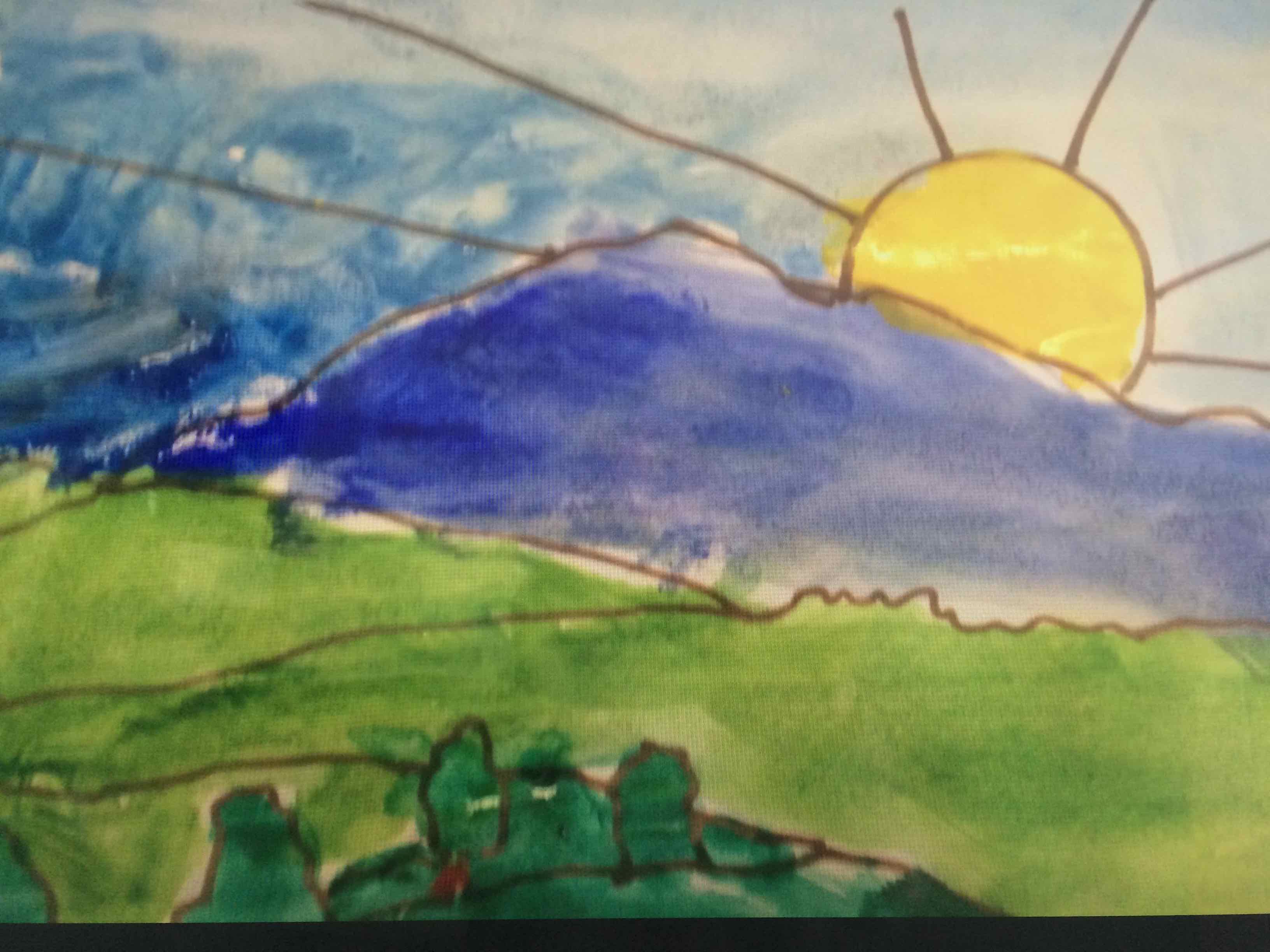
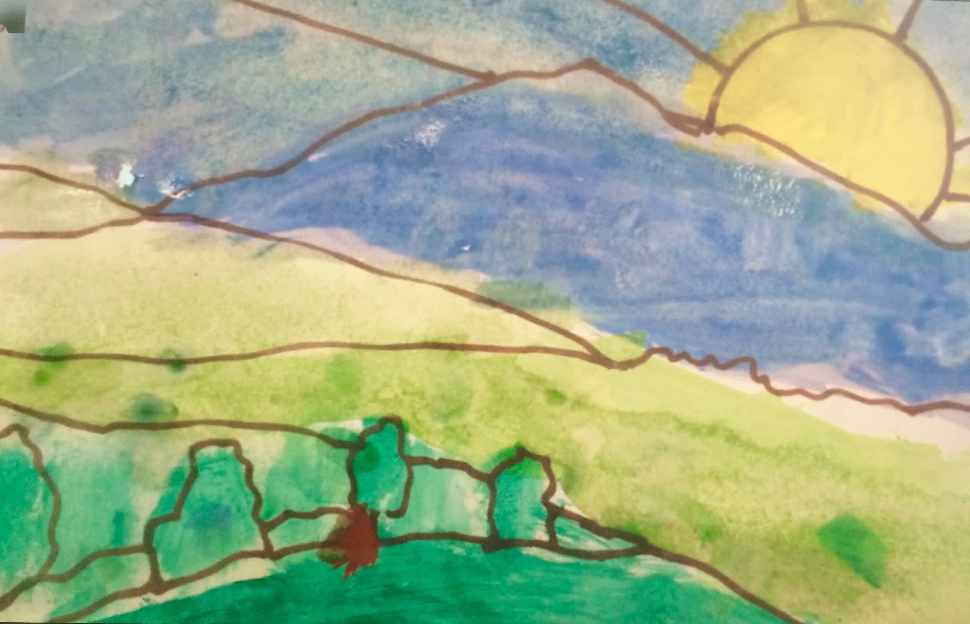
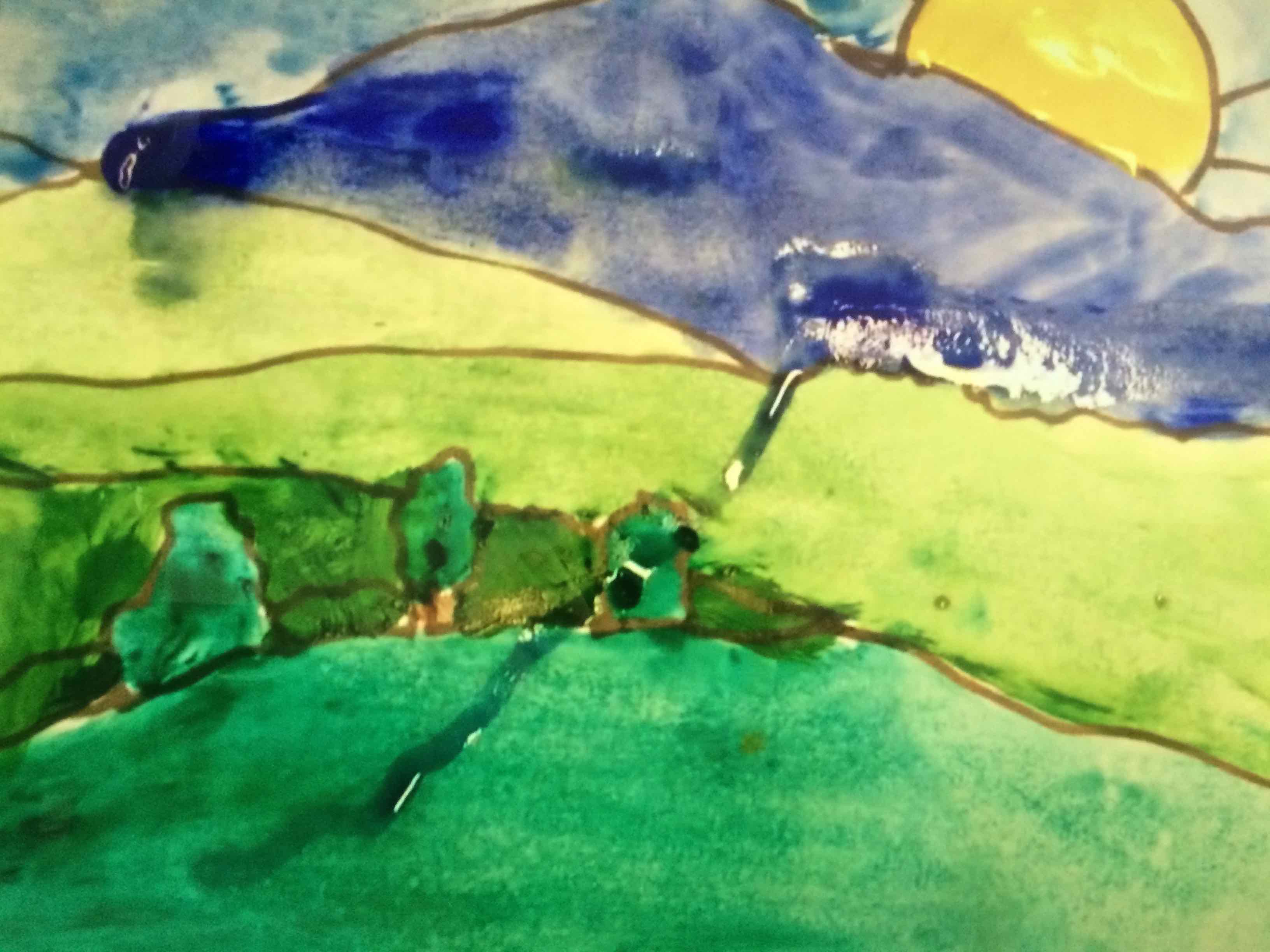
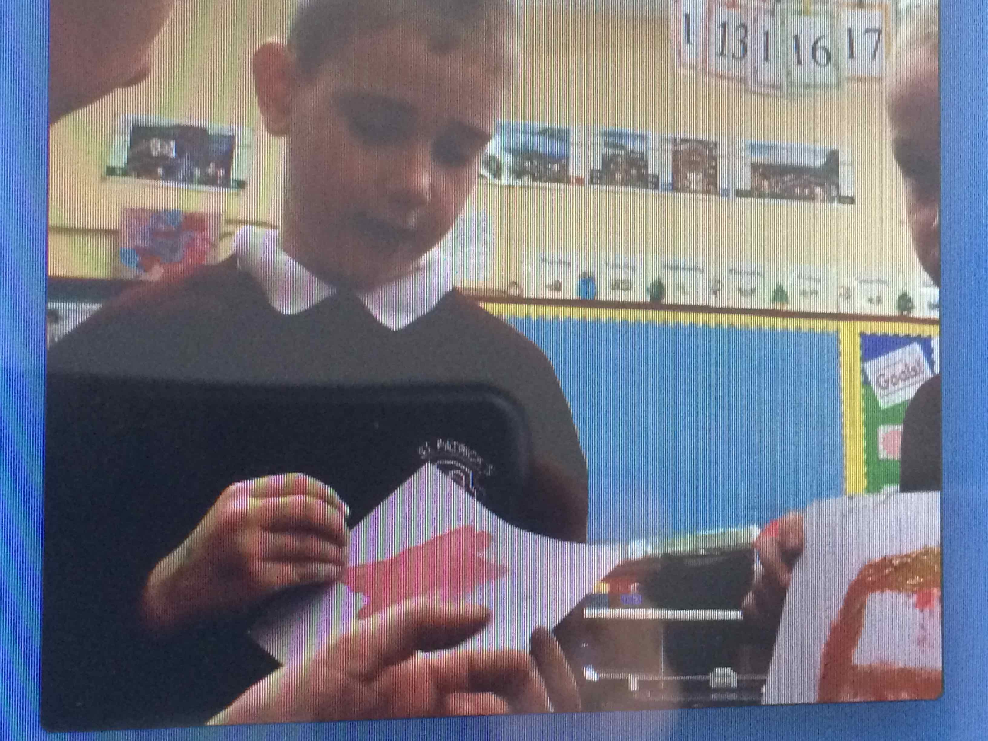
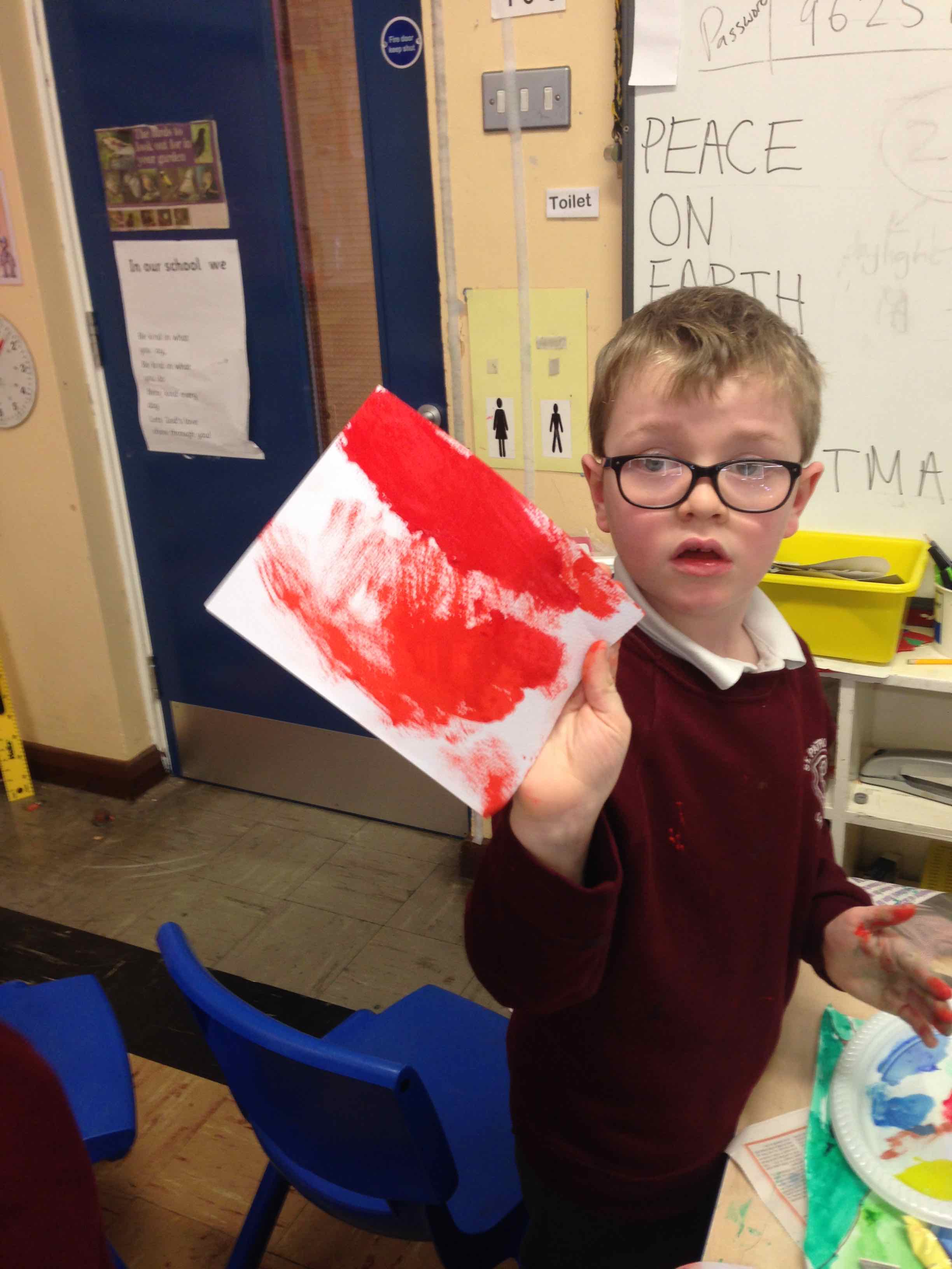
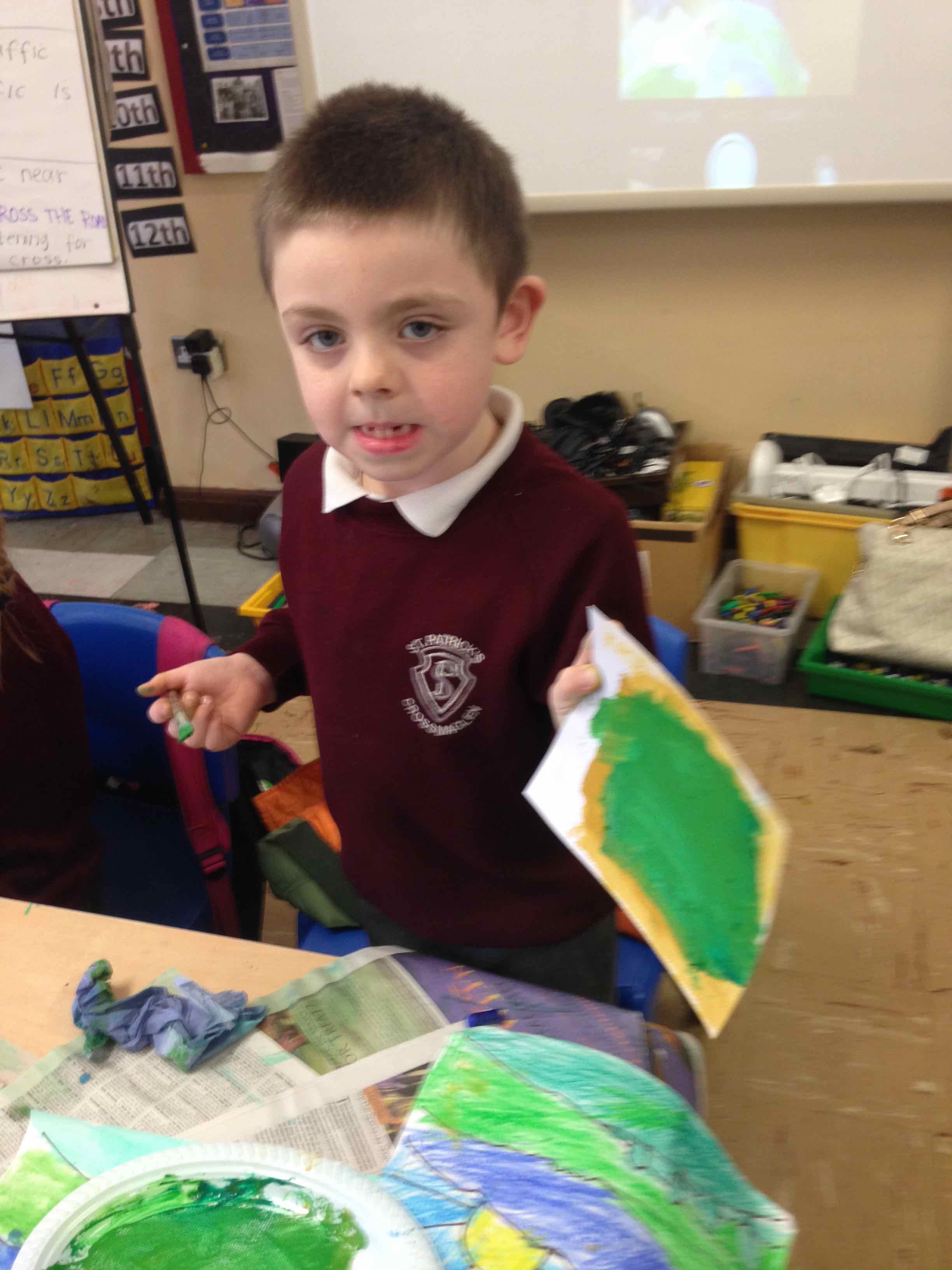
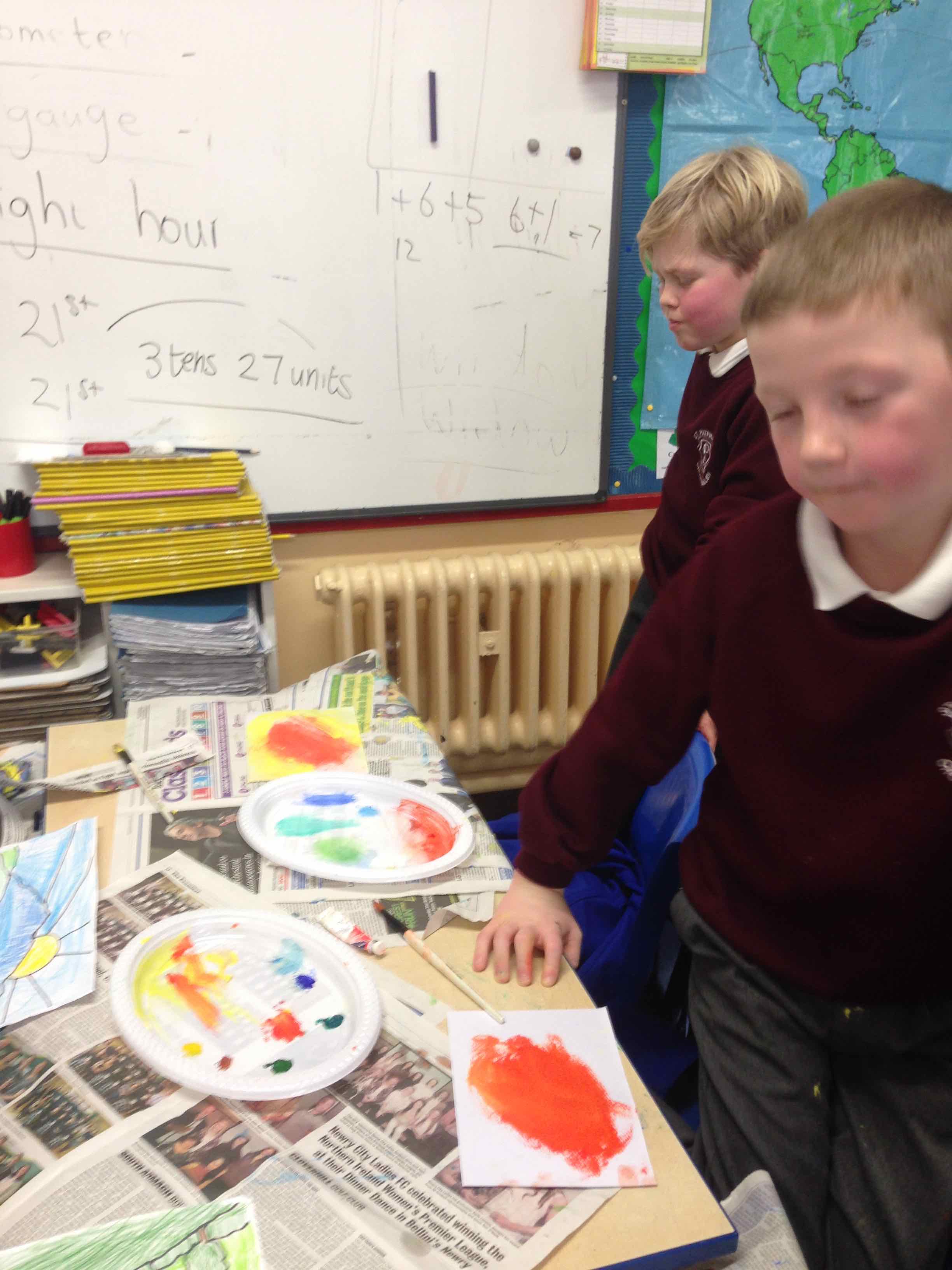
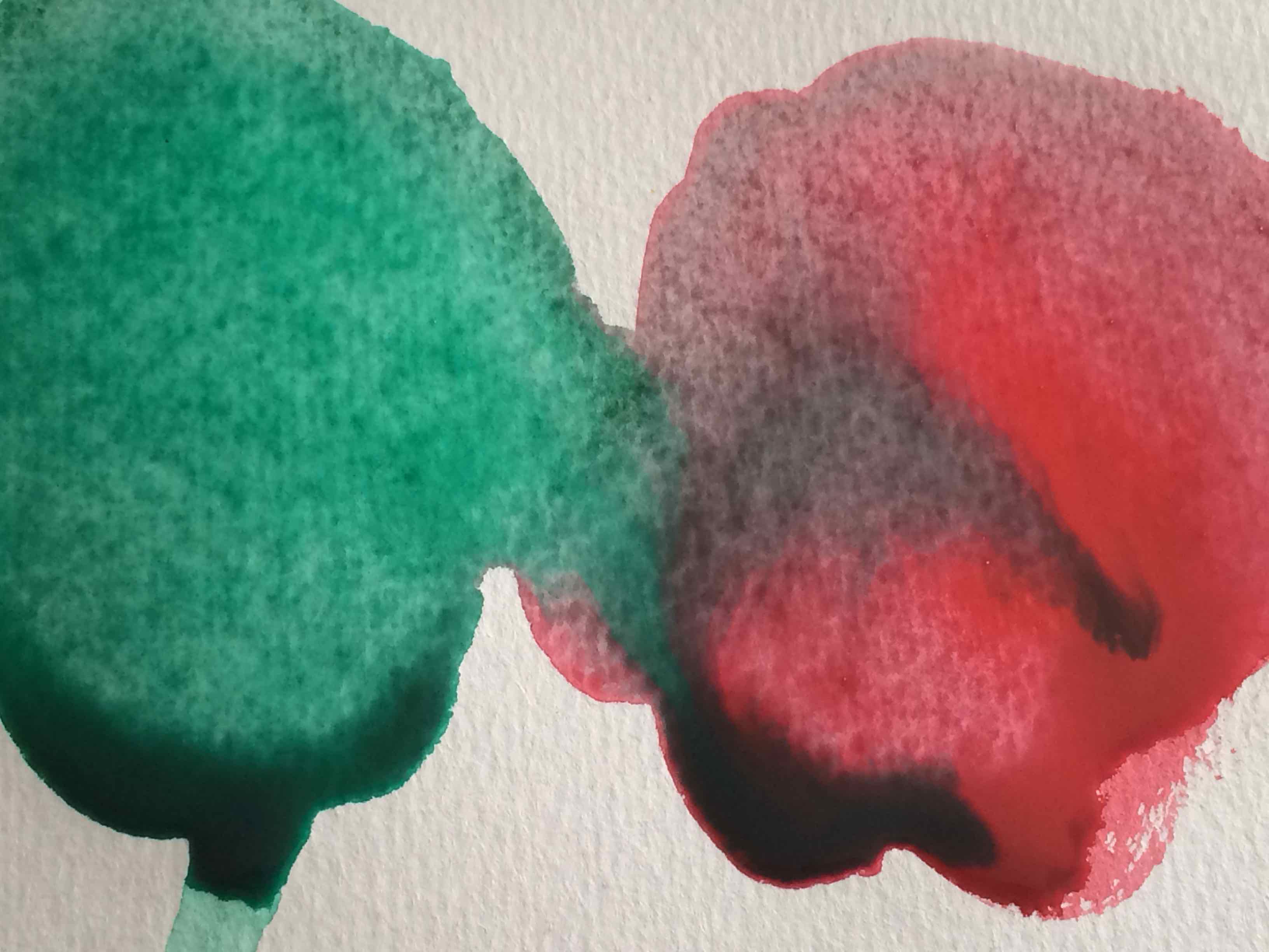
After break we tried again to COLOUR IN the picture, using the other copy but this time we were going to use WATERCOLOUR PAINT, WATER and BRUSHES.
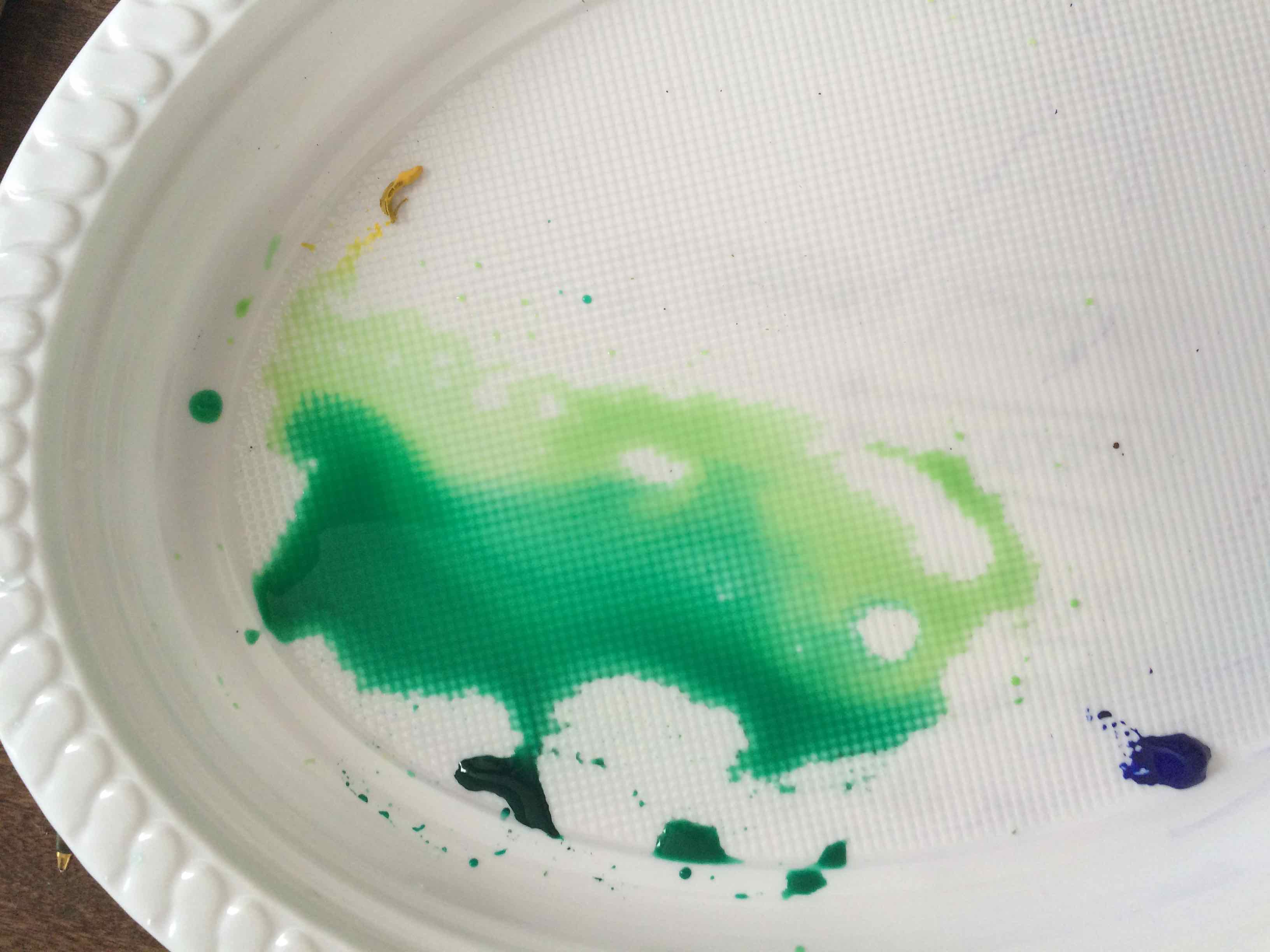
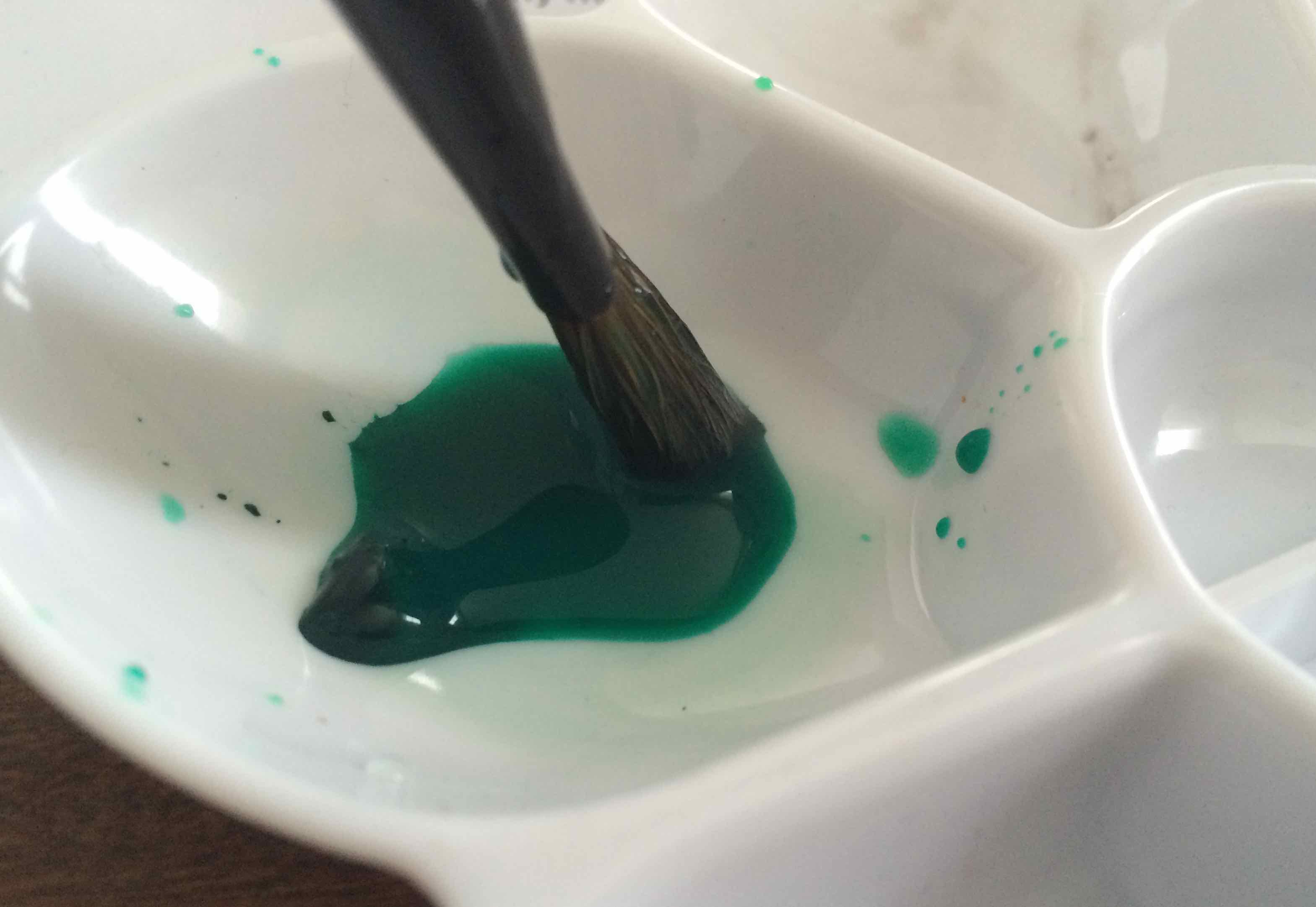
I encouraged the children to use LOTS OF WATER and they soon discovered that the way to make a LIGHTER shade was to add more water to the paint. The other thing we discovered was that the water really soaked the paper and this made the paper very easy to rip or tear.
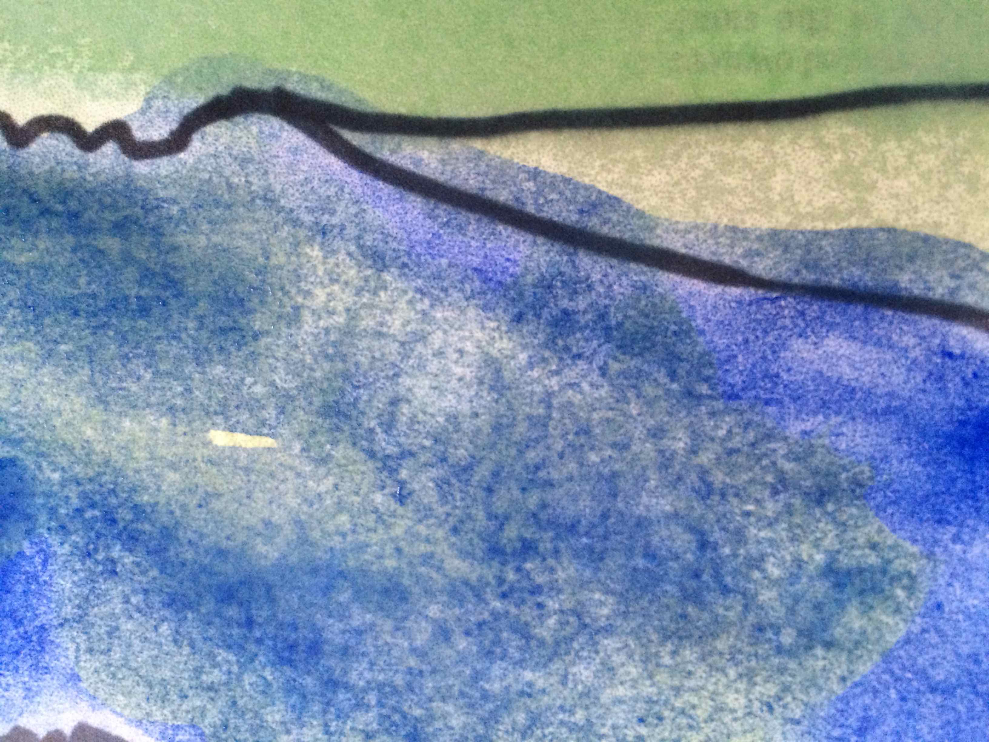

Here’s a selection of the children’s work:

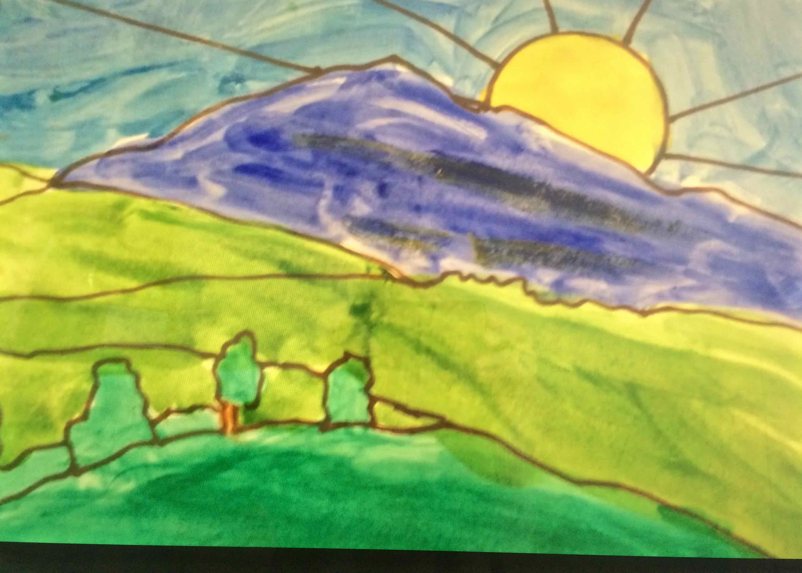
We like the differences in these works and the effects of the paint…
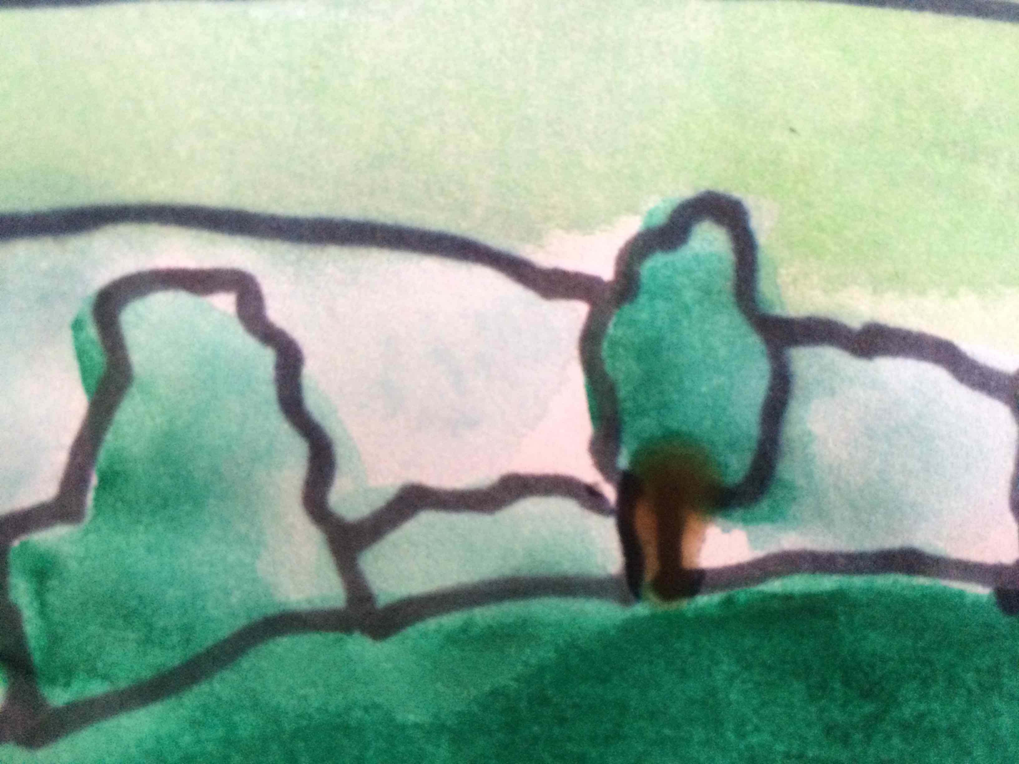
Here’s some more:
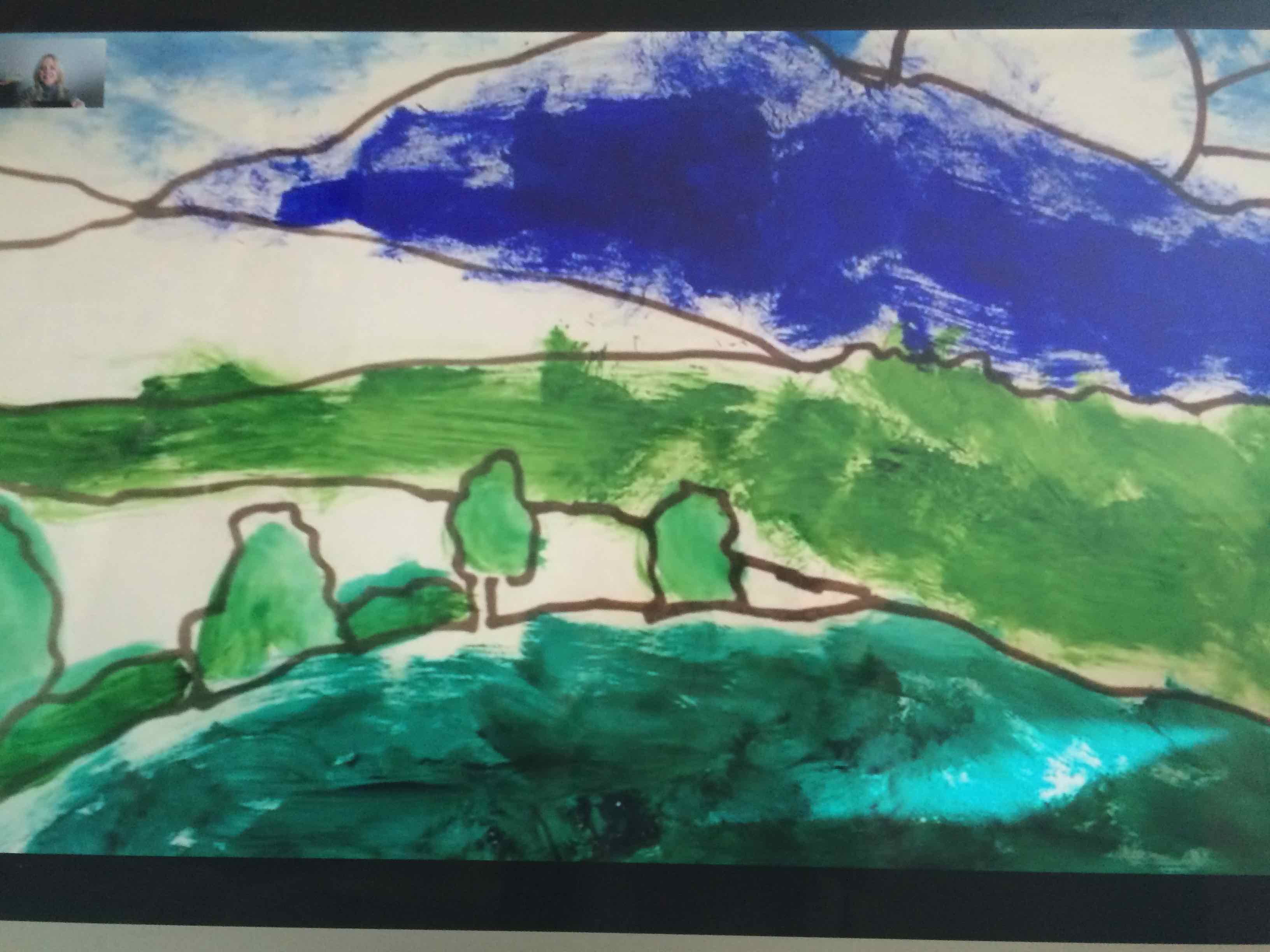
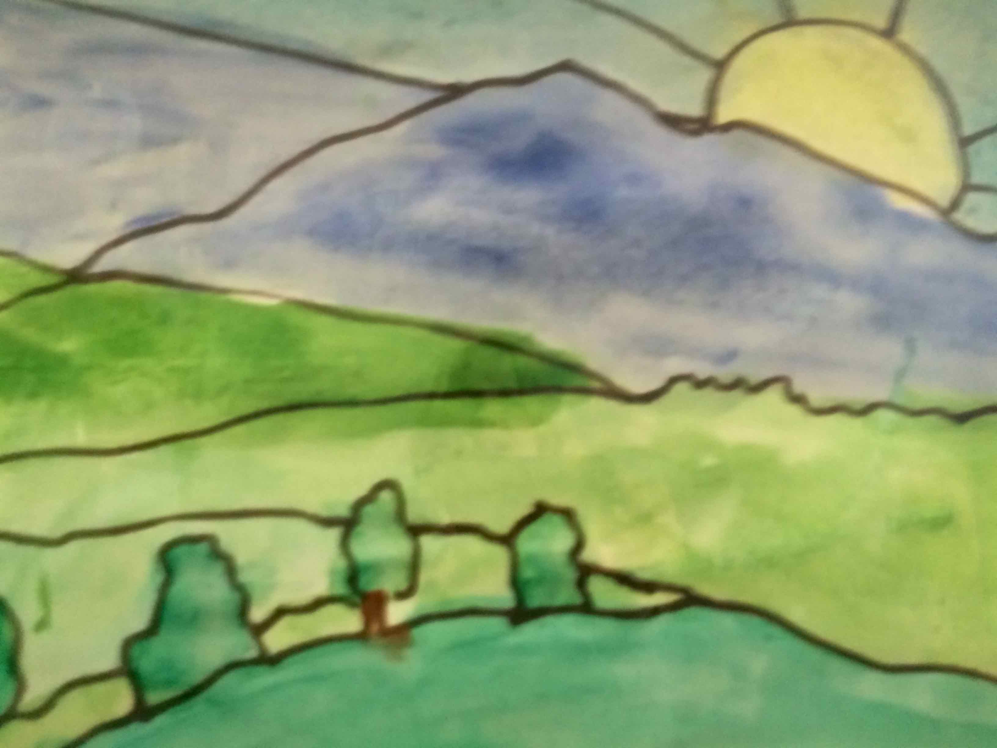
Next we used REAL WATERCOLOUR PAPER instead of copy paper and printed image.
The children said the paper felt stiffer and less bendy than the other paper. they thought it wouldn’t rip when water soaked in.

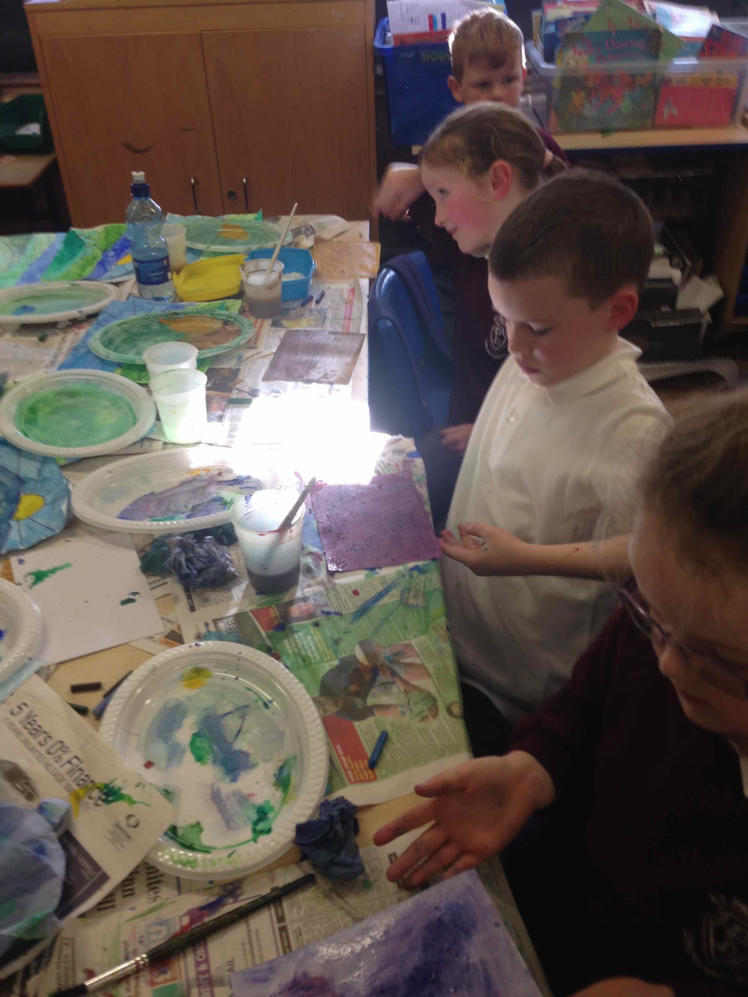

We ran out of time and so we hope to continue our exploration of watercolour and its effects as it relates to our project!
Here’s the P3 display showing the similarities and differences that we explored…